UX Audits – solving problems and delivering a seamless user journey
23.09.2019 | 3 min read


Have you ever found yourself asking any of the following questions about your product or service?
- What’s stopping customers from signing up for our product?
- Why are users getting stuck at a particular point of the journey?
- What’s preventing people from completing an onboarding process or checking out?
Many product managers would agree that they frequently grapple with these issues. You try to guess what’s wrong and to tackle the problems logically, but you’re often so close to the product that you’re missing UX flaws – you just can’t see the wood for the trees.
This is where a UX audit can come in very useful and we’re here to show you how it works in practice.
This article is for you if:
- You want to understand more about how a UX audit can help you troubleshoot and deliver a better user journey
- You want to see a real-life application of a UX audit
- You’re wondering about the next steps in undertaking such an audit
Why me?
- I work as a Senior UX Designer here at 10Clouds, having worked across many different industries in the past where I helped design and research a client’s new or existing product to elevate it further with a robust experience
- I’m part of an incredibly talented team of designers, developers, project managers, marketing, and sales team that help me do the work better and faster
- Here at 10Clouds, we’re experts at creating web platforms, where in the past we’ve delivered cryptocurrency apps and booking system solutions among others
- Our aim is to work with clients from any industry that needs an expert team to help build or shape their product
Our audit of HBO Go
Along with Netflix and AmazonPrime, HBO Go is a major streaming platform, the home of Chernobyl and Game of Thrones. So why are user figures dropping? We had a suspicion that it might be more than just the fact that GoT fans are abandoning ship having watched the whole series. Indeed, there were a number of comments online showing users’ frustration about design flaws in the platform.
At 10Clouds, we are leading the way among Polish software developers in creating exciting, user-friendly websites and apps for our clients, but we also support them in improving existing products through a variety of audits. We have three main types of evaluation:
Heuristic – which focuses on system behaviour, user experience and the visual layer
Cognitive – which highlights current issues set against UX principles, asking questions from the perspective of the user and providing recommendations
Rapid – a simplified version which combines both of the above approaches
So what’s wrong with HBO Go?
We found that the majority of HBO’s UX frustrations were focused on the registration form and the platform homepage itself, both of which hold the most important user goals. Let’s dive into the key issues and our suggested solutions.
The Registration Form
Registration Form
- A confusing ‘back’ button: Users can see the above overlay when they click on the register button. The ‘back’ button causes confusion, making users question what would happen if they click it.
- An unnecessary need to scroll: Here we can see that the register screen is a scrollable overlay, hiding information below the fold. There can be a design solution that shows all the information, without needing to scroll.
- A distracting background: The background image in this overlay affects the signal-to-noise ratio, which can distract users from the primary task at hand.
- A too-small font size: This section summarises the benefits of HBO Go. The small font-size and significant amount of information can distract users from registering.
- Lack of pricing information: The benefits mention that users get a 1-month free trial, but there is no mention of cost anywhere on the homepage, which is a clear tactic of gaining sign-ups before revealing price.
- No helper text: The fields don’t have helper text or in-line validation to show what the requirements are for a correct password. This is something small, but crucial to have for every form.
Platform Homepage
Platform Homepage
- An overwhelming amount of content: Landing on the platform homepage, the first impression users will get is how much content is visible, starting with a rotating carousel with series and movies. If users are bombarded with content, it will make it difficult to find the most important information, action, and a series or movie to watch.
- Poor legibility: The primary nav is placed on top of the imagery with a transparent background. This can cause legibility errors or simply that users have to put in more effort to spot it.
- Lack of a ‘my HBO’ page: When adding a movie or series to your watchlist, there is no ability to access a page for this. Users can only access this on the homepage, below the recommendations section.
- Too many clicks: The primary goal of users is to watch a series or movie by clicking as little as possible. Unfortunately, when clicking on a series or page, subsequent pages are presented, before a user can actually click ‘play’.
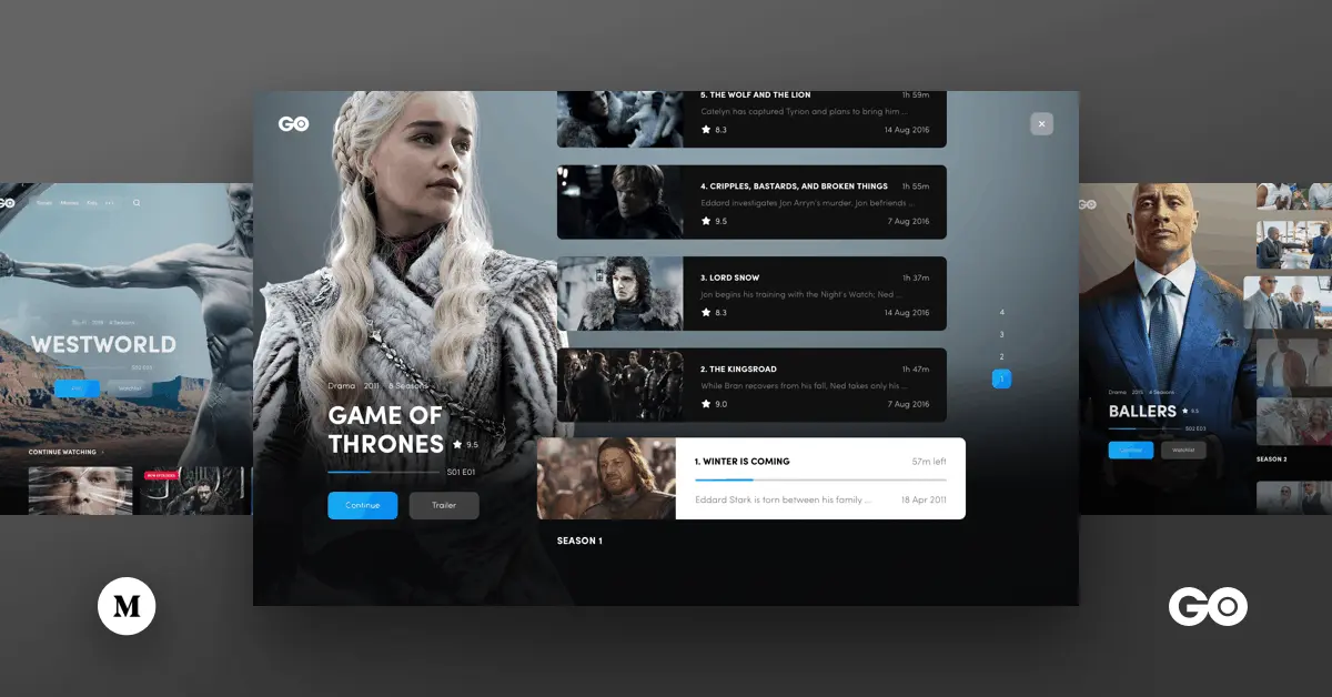
Movie Page
Movie Page
- A difficult to notice ‘play’ button: The primary action of this page is to play the movie. However, when first looking at this page, it took us a while to spot the play button. Users will need to scan the page to find the play button. This should be more prominent. Sometimes making a button bigger is just what is needed.
- No functionality showing progress: This movie has been previously played, but users cannot see this or how far along they are.
- An overwhelming amount of information: Overloading users with information makes it difficult to focus on the primary task, which is finding the play button and starting to watch the movie.
Recommendations
We prepared a proposal to redesign the landing page and part of the platform. Our goal at this step was to see how we could improve and visual the User Experience by fixing the key issues. Often enough, small hotfix changes are enough to significantly improve the usability of the product.
So what are the changes and improvements we made?
- We tweaked the primary nav to make sure users can always see it, even when scrolling over all the content and viewing sublevel pages.
- We reduced the content on the site to ensure users don’t feel overwhelmed. The aim here is to allow users to explore content and hopefully find a series or movie that interests them.
- We added a link for watchlist in the primary nav, allowing users to see how many series or movies they have added, and visit a dedicated page for this.
- We added a progress bar for a watched series or movie that uses the brand’s blue color. Users will know exactly what they started watching and how far along they are.
Our audit showed that the HBO Go platform has a few serious errors, a bunch of noticeable errors, and a handful of cosmetic errors. All of these errors affect the user experience and greatly reduces the pleasure of using a paid platform. Fortunately, we did not come across any critical errors. So it seems, viewers could achieve the most important goals, with some slight annoyances.
With a UX Audit, we wanted to highlight the issues users may encounter that limits them from achieving their goals. And to show how it should be to get rid of all the errors, we provide UI designs with the recommendations. This process can be done rather quickly, while also keeping the cost relatively low.
Are you looking for a team to provide you with a highly-effective UX Audit?
Get in touch with me on gialdo.muller@10clouds.com or visit www.10clouds.com. We have the expertise you need to make your product excel.
Looking for further articles on UX? You might find the below useful:
UX Designer and Back-end Developer: Brothers in Arms
Presenting User Experience