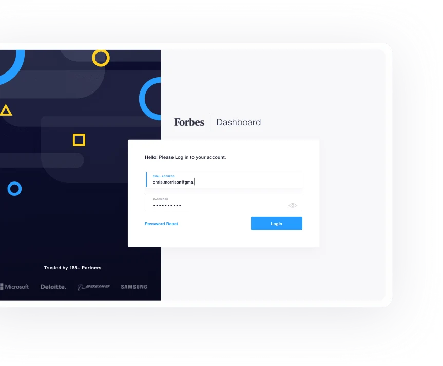
The Forbes Dashboard:
A Vital Tool for Forbes Team
10Clouds designed a user-friendly dashboard that allows Forbes’ clients to monitor and evaluate the performance of articles. We started the project by conducting a heuristics’ audit, then prepared mockups in step with the new Forbes style guide, and ultimately handed over the final designs below budget.
Services
Our challenge
Marketing managers spend too much time on gathering analytic data of branded content campaigns published on their website. Scouting for data from various sources, putting it together and passing it to clients is often a difficult and needlessly complicated process. Forbes and its clients needed an all-in-one tool for managing and monitoring their campaigns.
How we made it happen
10Clouds created a design for the Forbes Dashboard - an intuitive web tool that gathers, displays, and exports multi-source analytic data for Forbes campaigns. The dashboard can be used by both Forbes’ staff and clients. It’s giving them direct access to data, thus saving both sides a lot of time. This solution wouldn’t work without spot-on design and data visualization - that’s what we delivered.
Check other case studies
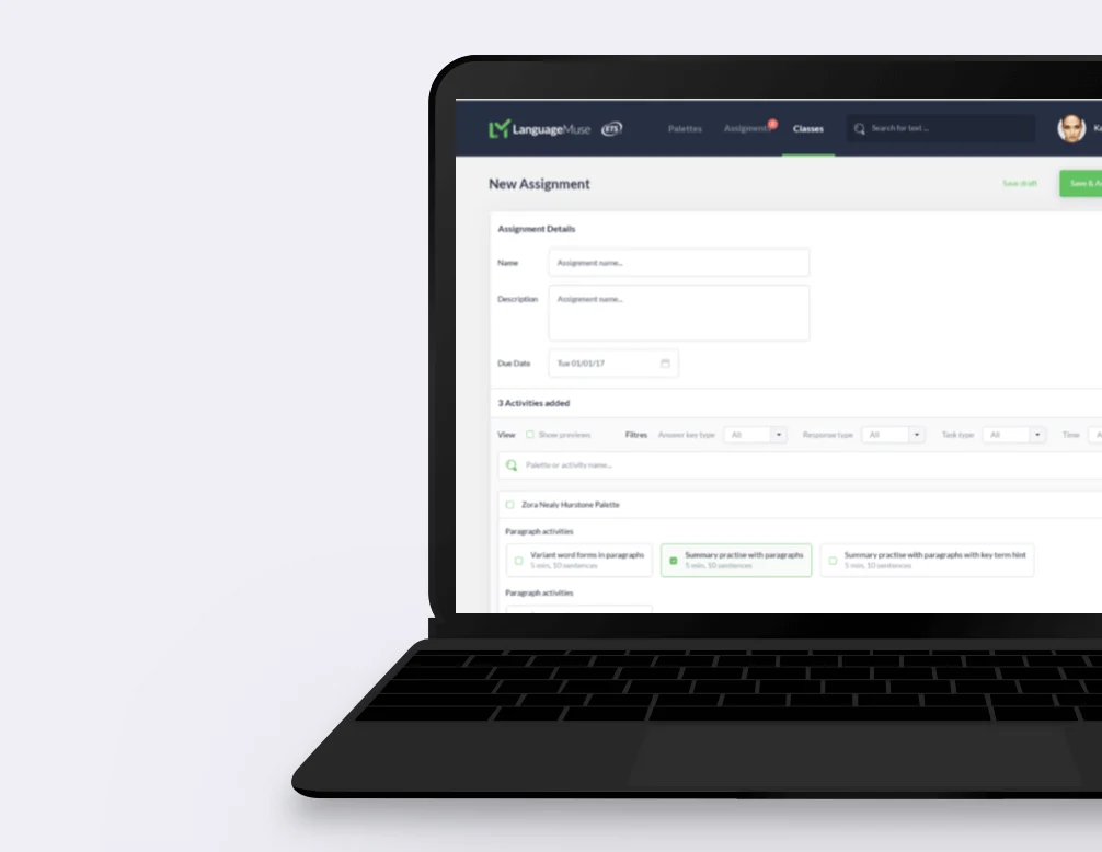
ETS Language Muse
Language Muse is an NLP-based educational platform for teachers working with U.S. students who face the challenge of learning English as their second language.
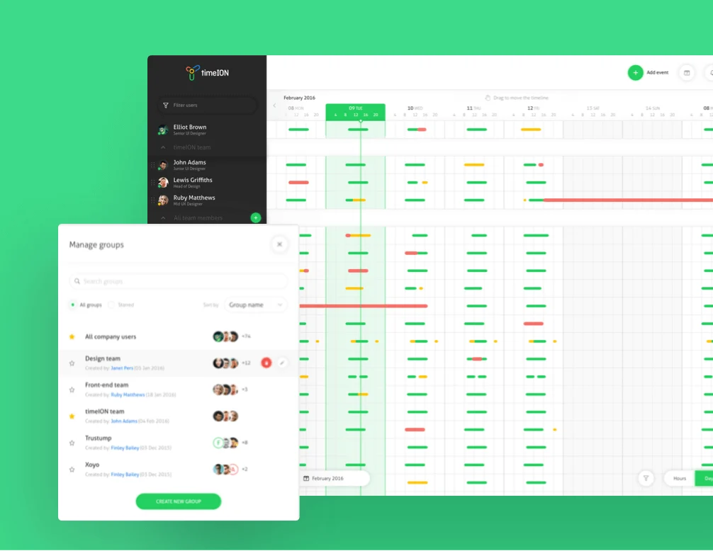
TimeION
TimeION simplifies the time off request policy and makes the experience pleasurable for both employees and managers.
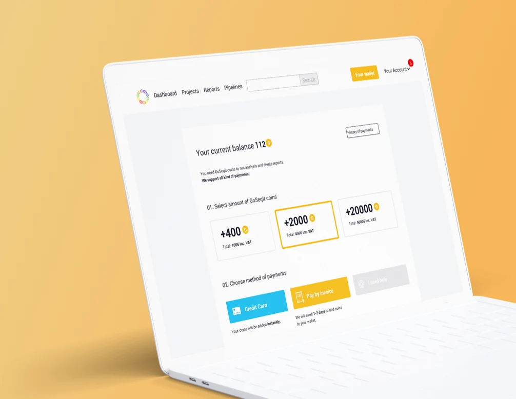
GoSeqIt
10Clouds provided a platform that allows conducting DNA analysis through the internet, from any place on Earth. It computes and stores all data in the cloud and generates legible reports.
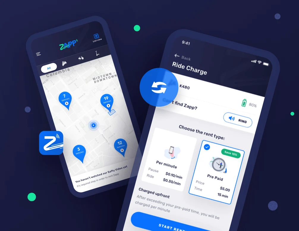
Zapp RideShare
Zapp RideShare is an electric scooter rental service operated with a mobile app. Our team is responsible for the complete product makeover.