You will find tons of links and guides, best practices, and examples when looking for Design Systems-related articles. You can get the impression that everything was already written on this subject. We all know how important the role they play in modern product development is, how they bring efficiency to product teams and how big is the ROI. But every time we mention a Design System or a startup, we hear a buzz. Design systems cost money, and with a full-blown approach, we are talking about big money, time, and team engagement that most start-ups cannot afford.
But does it mean that startups are a lost cause in terms of design systems? Does it mean they don't need consistency, efficiency, scalability, and other benefits design systems can provide? Of course, they need those advantages, and they need them dramatically. They need to deliver prototypes to investors, prepare MVPs, and quickly validate ideas, gather feedback, and implement changes in the product in a frictionless manner.
What's better than utilizing the most important design system values and bringing a new level of effectiveness to the often chaotic and rapidly changing environments of startup businesse?
What Is a Design System?
One of the official definitions (and yes, there is more than one) states that "a design system is a collection of reusable components, guided by clear standards, that can be assembled together to build any number of digital products." In other words, a design system contains whatever your organization needs to communicate design decisions.
But what does it mean? To establish what a design system is, it's better to start with something more familiar.
Some of you might have heard of brand guidelines, voice, and tone, UI kits, or component libraries— they are often misunderstood as an equivalent of a design system, but the most crucial knowledge is that a design system is not one of those elements; a design system is those elements combined together. To explain the difference better, I'll use a great example provided by Dan Mall, who is a well-known design system consultant and helped multiple businesses introduce design systems into their workflows.
The first thing to understand is that UI Kits, which are created in Figma, help us designers, while component libraries bring effectiveness to developer teams.
What Does the Design System Do?
Design systems help product teams deliver software faster and better. How does the design system help the whole product team? Because it consists of many elements connected together.
Here is a visualization of the design system understood from our perspective. This visual shows what artifacts, and physical elements are needed to build a full-blown design system.
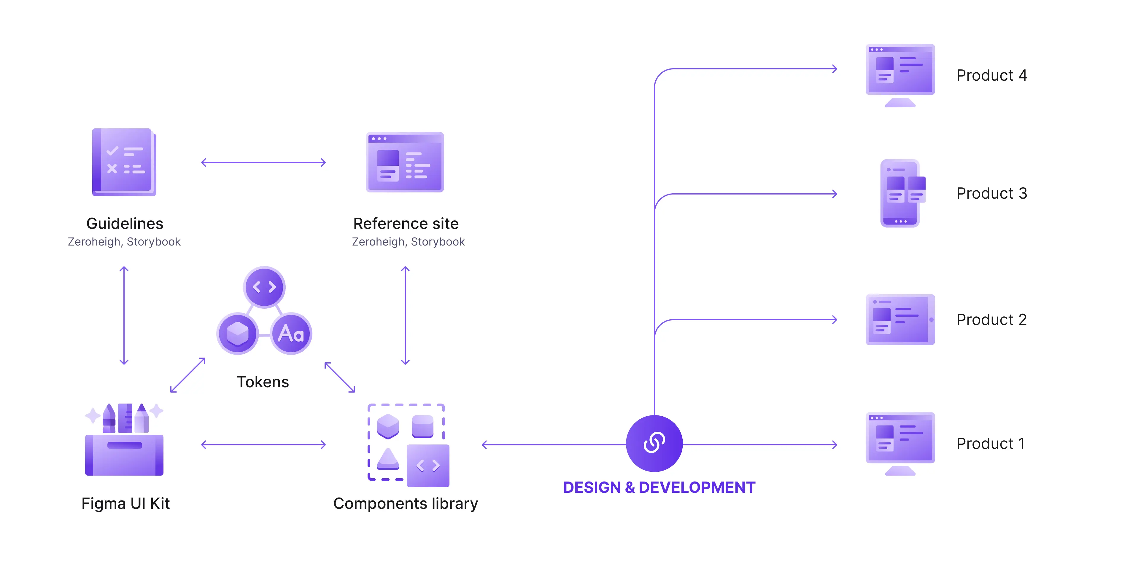
Web designers usually start with the Figma UI kit, then enhance it with design tokens. Somewhere during the process, documentation is created. Then the developers take those elements and reflect them in their component library. With time, the fancy reference site is added, which is the single source of truth for designers and developers who are the consumers of a design system.
And what is most important — all those elements are connected, so every change implemented in part of the system will be reflected in products that are linked to the common components library.
How Did We Sell a Design System to the Startup?
To be honest, we didn't. We never approached the client and told them we will build them a design system. We all know too well what their response would be: "No budget. No time. No, thank you."
We took a little different approach, taking into consideration all the key indicators that tell us about the need for systematization.
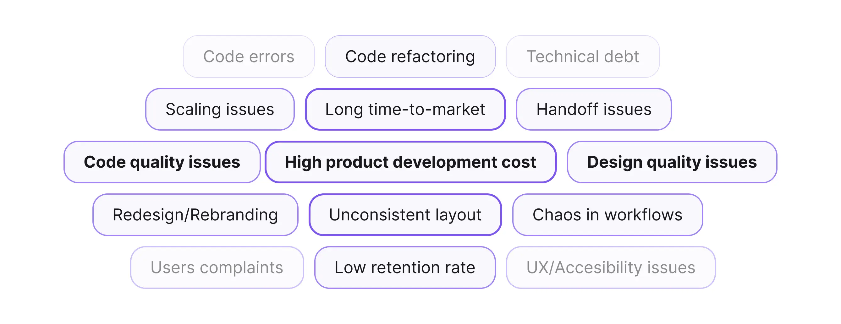
Our Indicators
But let's start by adding some background. Our client was a dynamically growing startup composed of traditional finance veterans and digital asset innovators that have been active in the space since as early as 2013. Their main focus was combining the advantages of digital assets with the trusted benefits of the U.S. banking system. They trusted 10Clouds with the project of a safe and reliable digital trading platform with a "best in class" user experience and outstanding UI.
We were far in the design process, with a clear visual direction and multiple layouts already in place. The design MVP desktop version of the product was at the final stage, and the first screens of the mobile app were already starting to form stories. The question arose: do we need a design system at this point? Looking from hindsight, I'd rather ask: why didn't we think about a design system earlier?
What We Had
Approaching every new project with best practices in mind, we created a basic library of styles and components. With a fast-changing scope and decisions regarding UI elements, feeling the cold breath of the deadline on our necks, we didn't think about building more than those core building blocks, and we were content with this solution until.
PROBLEM 1
We worked in a rather small team consisting of two product designers and one UX designer and divided our work by features, working simultaneously on different parts of the UI. We thought we were in sync, but with passing time, each of us started to question his or her decisions:
- Should this border be grey-30 or grey-40?
- Do we have a pattern for this flow?
- I think I saw something similar before...
As the number of screens grew, we approached more and more similar questions, and those were only design-related, as the development phase was planned after the design handoff.
It impacted not only the quality of our work but also prolonged the delivery of each stage bit by bit. We still met the deadlines, and the client was still content with the end result, but with every passing day, the team felt more and more dissatisfied and unconfident in our activities. We were also aware that with each new functionality and new added feature, our design department grew, and soon it could overwhelm us and even negatively impact the roadmap and our clients' budget.
Small Steps First
As we were not a dedicated design system team but a product team with our responsibilities, we could not afford to focus solely on the creation of new artifacts. We decided to start small, selecting the one person whose main responsibility would be to systemize our workflow.
We were well aware of our problems and discussed them during daily meetings and retros. There was no need to conduct user interviews or workshops—the first step in our design system roadmap was behind us. The website was already launched, and the desktop platform was in the early development stage, so an obvious candidate for a pilot was a mobile app.
With all those products launched, you might wonder if there was a need to invest all this work in the creation of the design system. There were a few important factors that let us believe this is the best option for our client:
- The branding was slightly outdated, and the client was more and more aware of the need for a redesign.
- The platform was designed as an MVP, with only basic features for the launch.
- New products and features planned by the client created a roadmap for the long months to come.
- We all knew that with a long-lasting product, well-planned maintenance would be essential.
- More indicators were still ahead.
The Hardest Part Was to Convince the Client That We Need to Slow Down on Delivering New Screens to Lay the Foundations for Future Scaling. How Should We Approach It?
1. Should we prepare a fancy presentation?
2. Should we show some widely available statistics?
3. Or should we provide the life-example of a mysterious design system thing?
Our client was familiar with the idea of design library and components, as we worked in this manner from the beginning, but we were in need of PoC for our idea. Then, the great opportunity arose.
PROBLEM 2
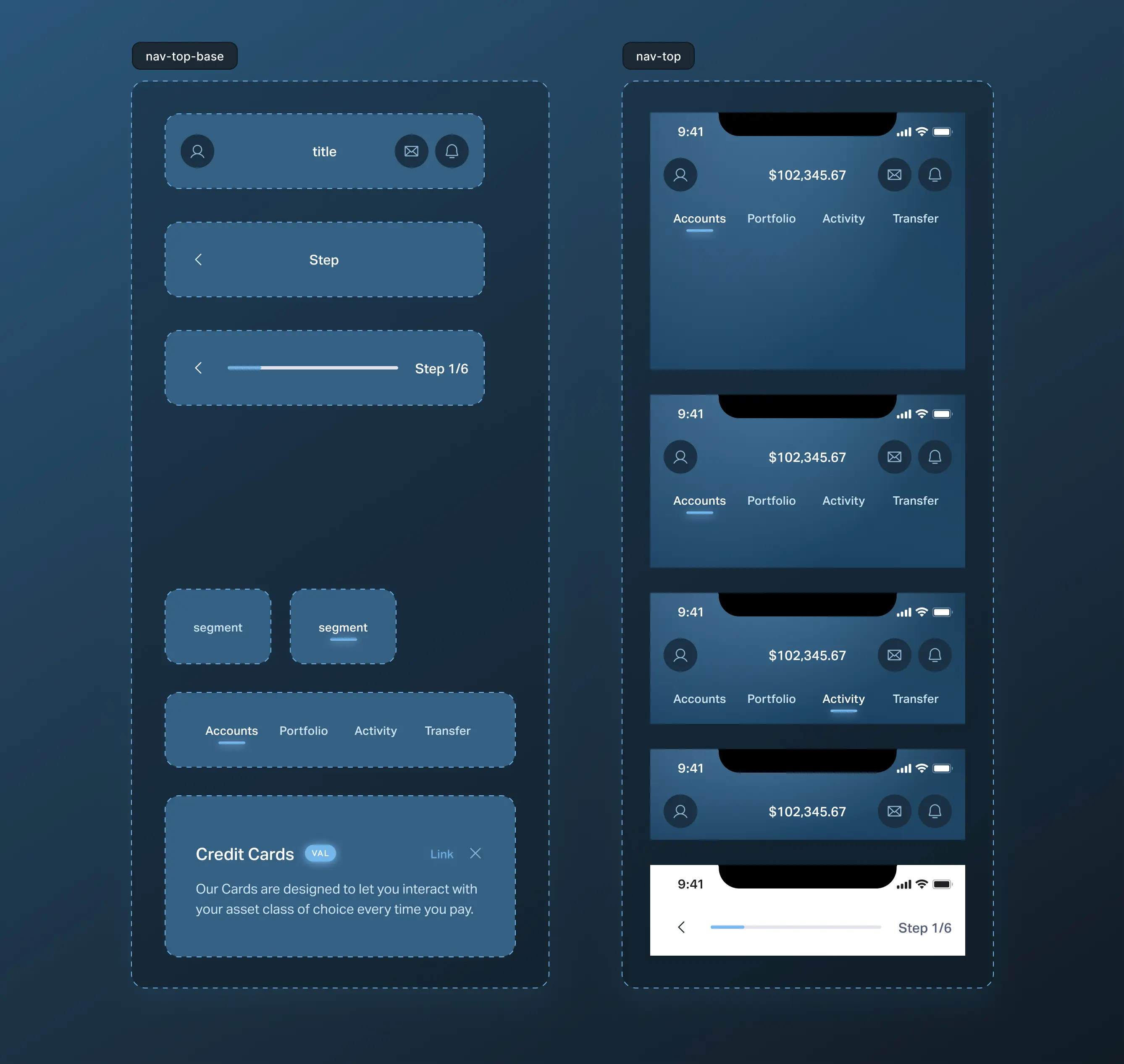
The client requested to change the top navigation, and we automatically knew that it would take us some time, as the top navigation consisted of many different content types, and we decided not to create a component. We did an inventory of our designs, and it became clear that it was a wrong decision. Across many pages and many frames, we spotted inconsistencies, starting from spacing, different font styles and fills, and ending with missing navigation elements.
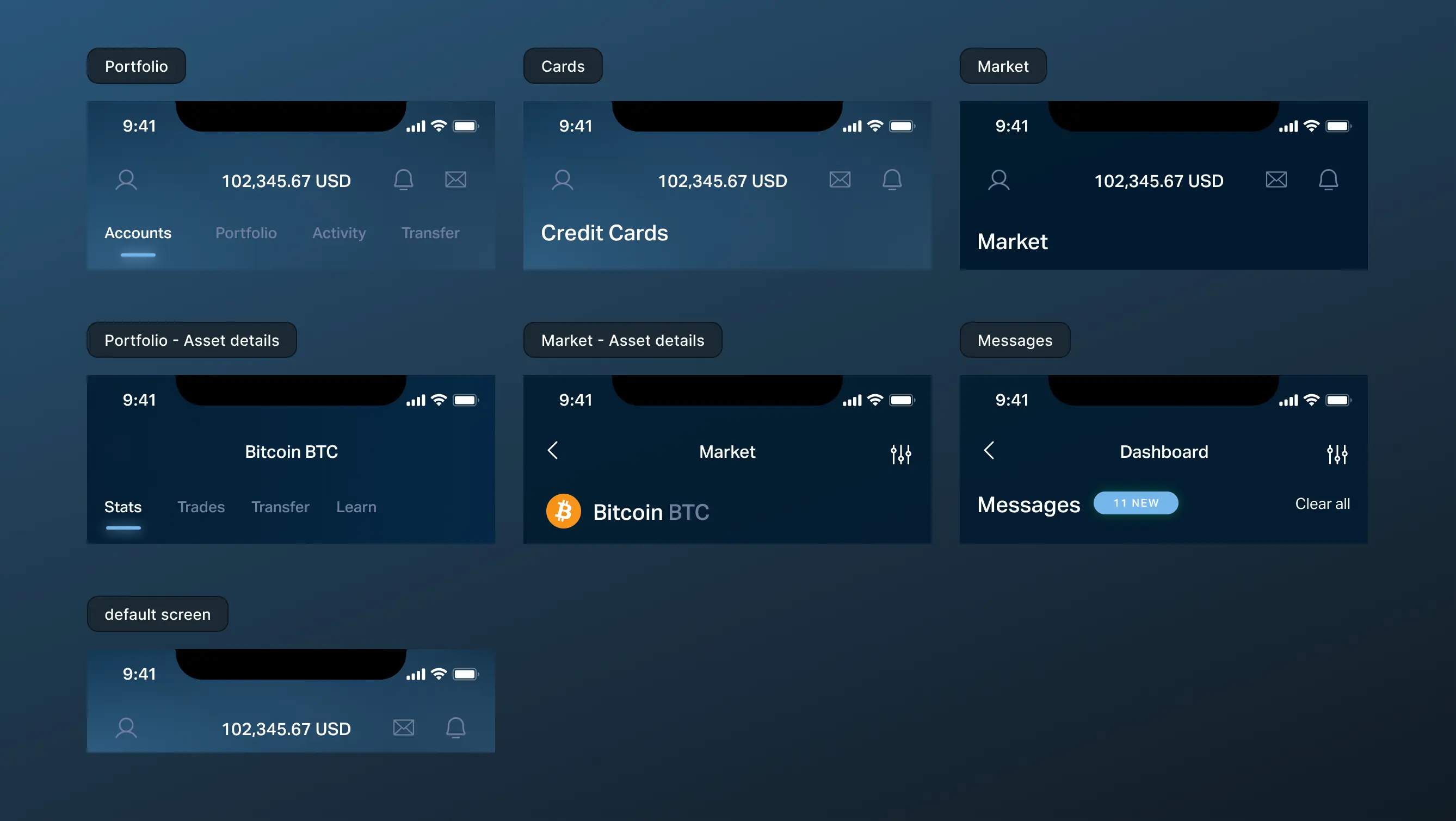
It was a perfect moment for a client's education with a dose of real-life experience. While one designer worked on a new proposition for the UI, the other mapped all possible layouts with content variants and prepared a component equipped with different content slots. It was also a moment to duplicate and archive the old design file and introduce changes on the new one.
Some of the work we were able to automate thanks to the Master plugin, but some we needed to do by hand. Either way, it took one designer less than a day to prepare inventory, map the component, and place its instances across all the designs (it was still an early stage, and the screen count was around 60).
During the meeting with the client, we presented the new UI and showcased the possibility of implementing changes in a faster and more efficient manner thanks to a component and subcomponent-oriented approach. It was an official green light for creating the pilot of our design system.
PROBLEM 3
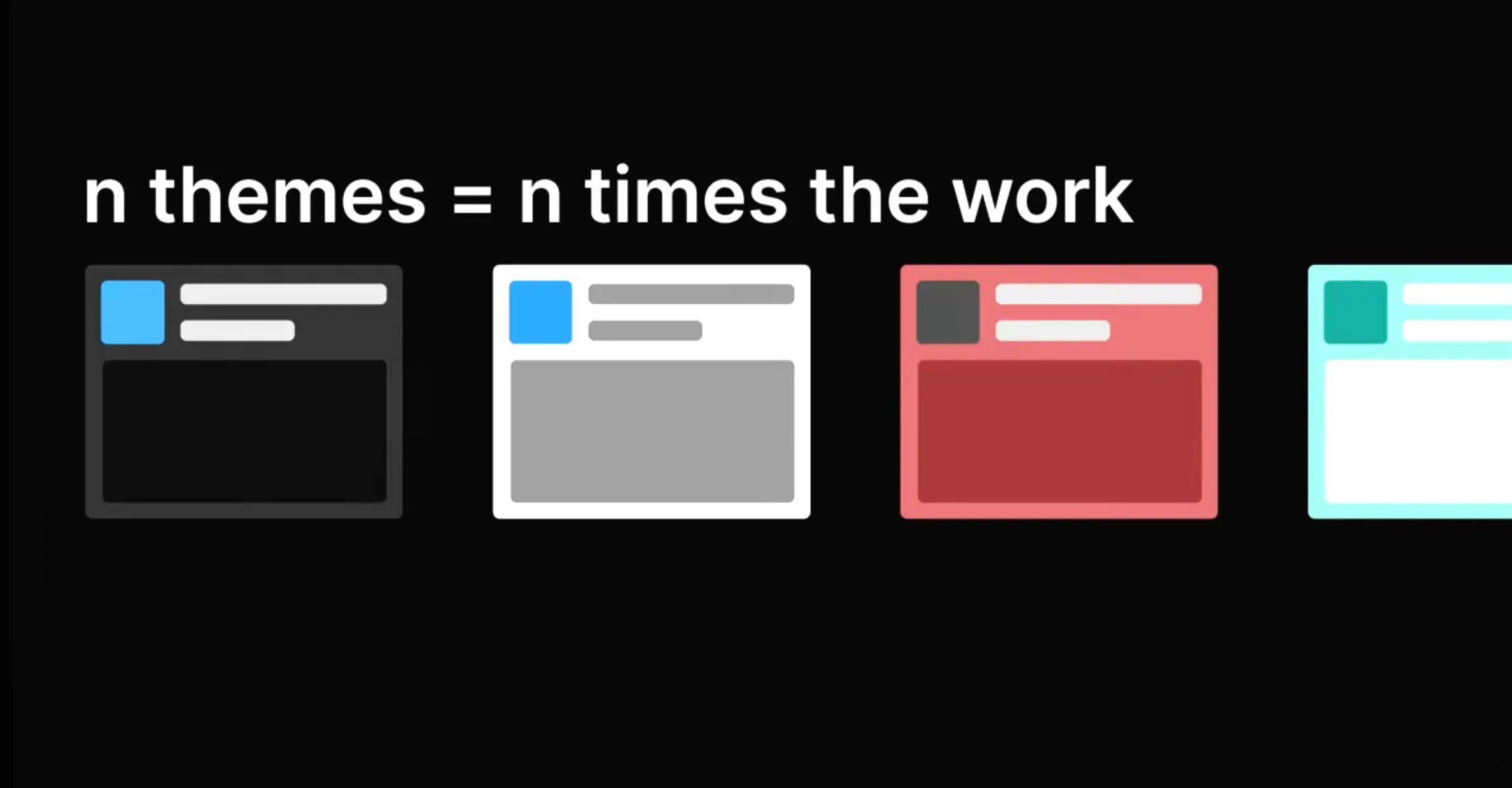
Our client decided to respond to their users' needs of personalization; therefore, themes and modes were added to the product roadmap — and yes, they were not of the highest priority, but they should be addressed sooner than later. It was another indicator that we need to take a closer look at our core library with styles and enhance it with a new architecture that will be able to adapt to the growing number of requirements.
The traditional approach where separate design and libraries were created would result in additional work, multiplied by the number of planned themes. With a tight schedule, our client wasn't able to afford theming and was considering either limiting themes to the minimum or postponing it for an indefinite period.
The hardest part about building dark mode is that people think it's easy — Figma team (Config 2022).
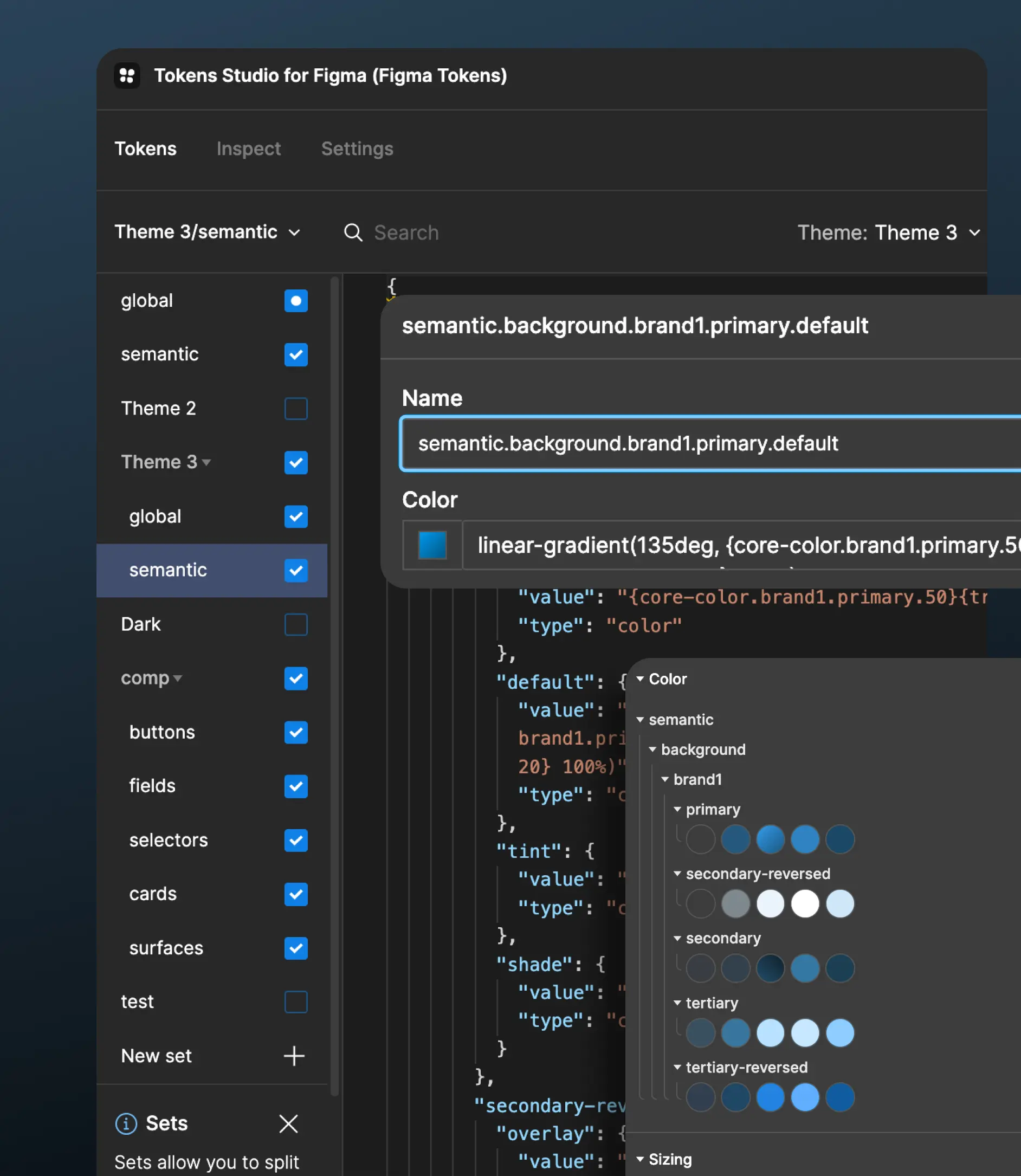
The solution came with Figma Tokens, aka Tokens Studio. This amazing plugin helped us to reorganize and connect styles on a new level, not available in Figma before.
Tokens are an inseparable part of every good design system. They are the smallest design decisions translated to code in a platform-agnostic manner. Those small decisions can be transformed to a specific code language and used by developers. The simplest comparison is a Figma style—tokens are also colors and text styles, but when Figma gives us a text style, tokens provide information about every bit, such as size, spacing, font-family, text-transform, etc. What's more, those values are not hard-coded. The true power of tokens lies in references. But this is a subject for a separate article.
Summary
Our client approached 10Clouds for a high-quality product, without requesting a Design System from us. However, our team ensured that implementing a Design System brought significant value to the process. With the Design System in place, ideation and iteration became faster, and the team could focus on important areas while mundane issues were handled by the system. Additionally, the inclusion of themes did not interfere with deadlines. With the Design System, the product was ready to scale instantaneously, simplifying the workflow and limiting communication barriers between designers and developers
Conclusion
Product teams and business owners might be aware of the pain points we have mentioned in this article. The knowledge that whatever impacts the product team - regardless of whether it is an external agency or in-house - has a direct effect on business stability and budget, is an essential factor to consider. Design System plays a crucial role in faster time-to-market and lower production costs since there's no need to start from scratch each time. While building a Design System from scratch might seem like an ideal solution, it comes with drawbacks that may not be suitable for young businesses.
At 10Clouds, we understand that implementing a comprehensive Design System for startups can be challenging due to constraints like limited time, resources, and finances. Consequently, we offer a more streamlined solution in the form of a Design System Lite, which is a flexible and cost-effective approach, enabling the entire product team to work cohesively. The lightweight version can easily evolve into a full-fledged Design System as the product and business needs grow.


