The journey of brand identity: Through the eyes of an illustrator
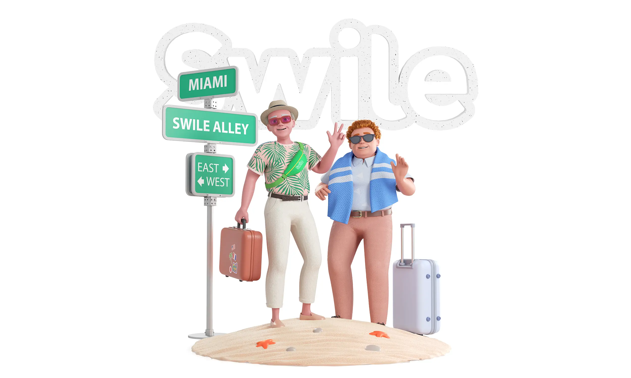
‘Brand identity’ has been a commonly used term over the past two decades, and it’s something that most product owners understand is vitally important to get right if you want to improve the chances of your business succeeding. But what role do illustrations play in brand identity? And how important are they when it comes to conveying your brand message? In the below post, I will talk you through one example of a project I worked on in which illustrations played a key role in brand identity. We’ll go through all of the different stages - from user and market research through to the finished product. I hope you find it useful and interesting.
Brand identity - what exactly is it?
People often use the words ‘brand’ and ‘logo’ interchangeably to mean the same things, but in reality, there are many elements which form an effective brand identity.
At its core, the identity of your brand is what users feel and think when they interact with it.
To quote Jeff Bezos, “Branding is what people say about you when you're not in the room.” Your vision, mission and values are important elements of your brand, but so are the visuals - the logo of course, but also the fonts, page layouts, colours and importantly - graphics. In the case study below, the graphics were actually illustrations, which played a key role in showcasing our client’s values.
Case study: Swile
The challenge: Swile is a company providing workers with payment cards which can be used for lunch and a whole range of other work-related activities which require payment. The company was previously called ‘Lunchr’ and undertook a rebrand at the start of this year in order to expand its product offering beyond meal vouchers. It’s aim is to focus on everything that happens at work but isn’t technically work - including joint payments for colleagues’ birthday presents, paying back co-workers, creating team-building events and more.
“Swile’s mission now was to find out what its current and prospective users valued the most when it came to the company’s offering and to build the new brand identity around this.”
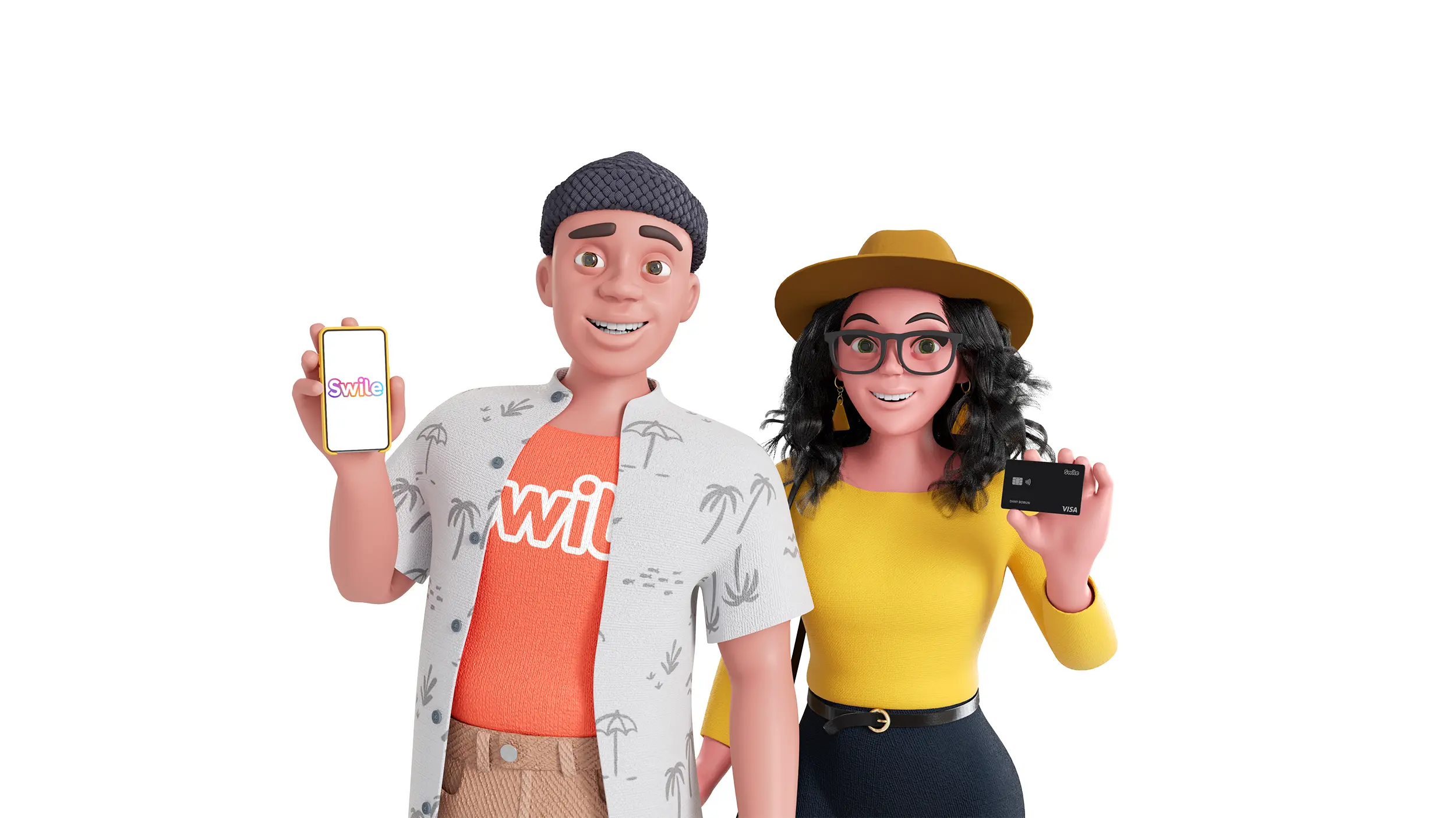
1. Research: In order to communicate its broader offering, Swile employed an agency to conduct thorough qualitative and quantitative research into its users. The idea was to find out what drives them, and to present this back to users through visual personas to which they could relate.
This research was then used as a basis from which to build a series of characters, all with very different attributes when it came to their backgrounds, motivations and behaviours. Swile approached 10Clouds for support in creating these eight characters, and bringing them to life. The graphics would be used extensively on its website and app.
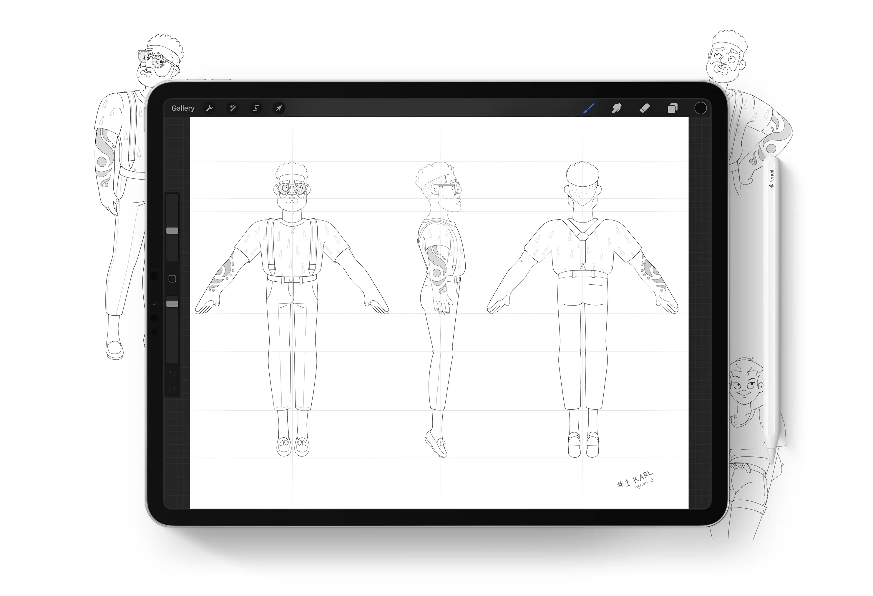
2. Character design: The character design began with the creation of 2D sketches, all of which showcased the unique elements of each character. It was important to get everything looking as distinct as possible, from skin tone to outfits, body shape and facial expressions.
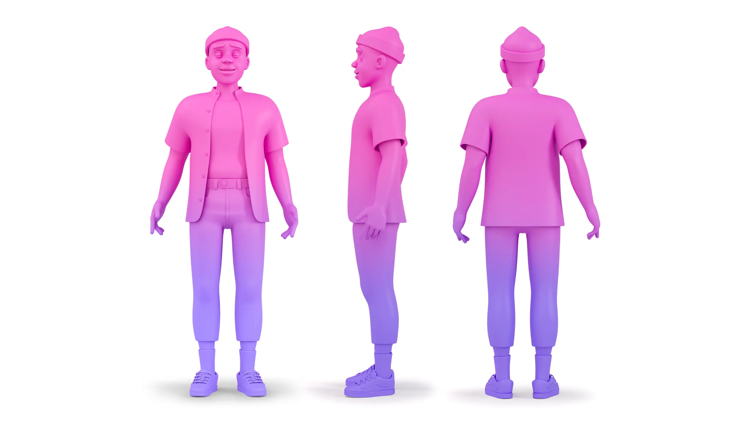
3. 3D modelling: 3D modelling is important in bringing illustrations to life, and allows the user to see in more detail what the designer created. From flat, 2D images, characters suddenly gain shape and become instantly more fascinating and recognizable. To read more about how 3D design can enhance your product, read our blog post on the subject here.
4. UV mapping and texturing: To give the characters character and personality, we created our own textures. We also drew individual features such as tattoos, added different skin tones, and created original natural-looking hairstyles.
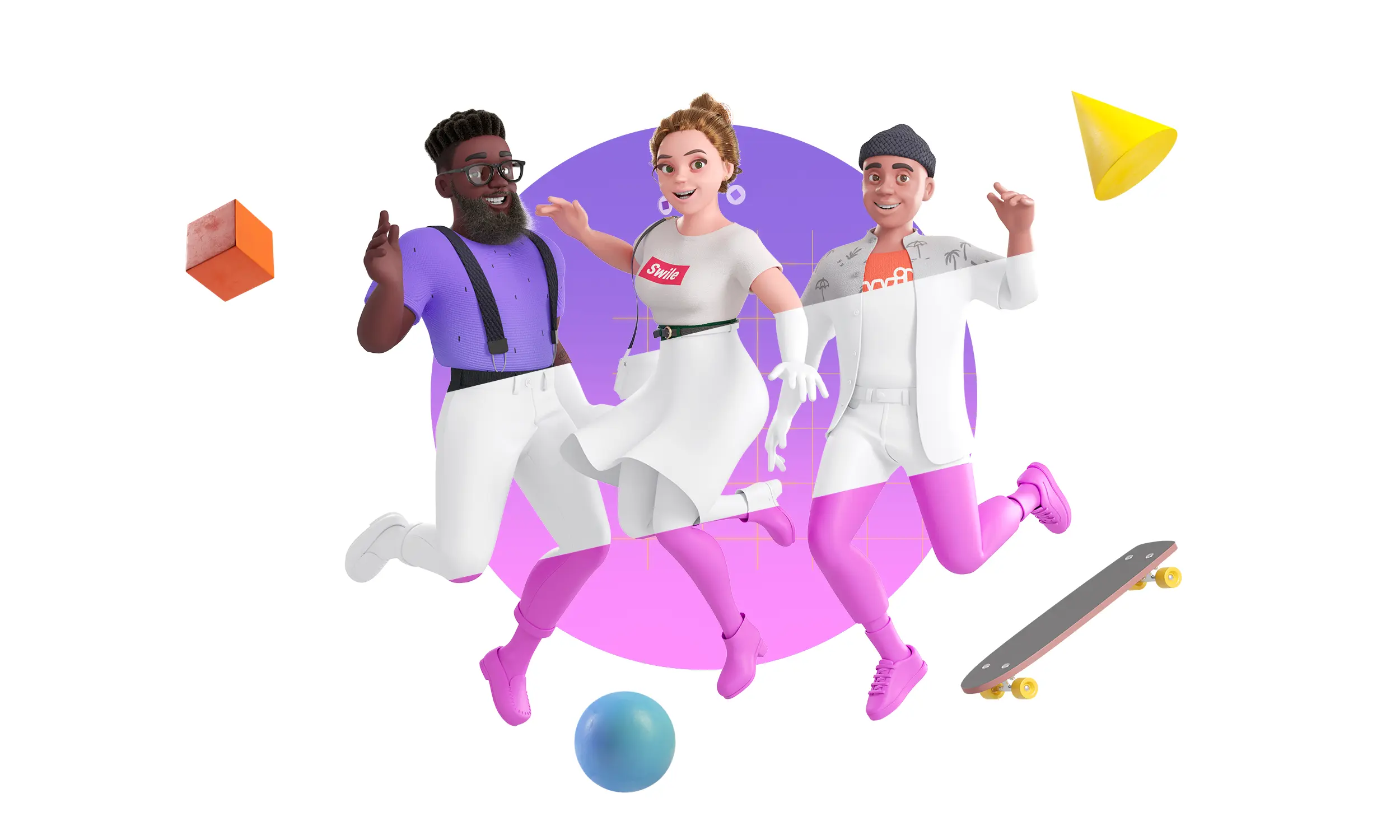
5. Rigging and animation: This final element enabled each character to be brought to life on the screen. We created bones for each of the characters, which allowed us to build magic-movement. We animated the eyes, created different emotions: laughter, surprise, seriousness and more.

The characters have now gone out into the world and can be viewed on Swile’s website. We’d encourage you to take a look and give us your thoughts. We hope you feel that they effectively bring the brand to life.
Looking for an experienced team to bring your digital product to life?
Get in touch for a free consultation on hello@10Clouds.com. Our friendly team will get back to you within one working day!


