Quick Guide to CSS for Back-end Developers

When debugging CSS code, how many times have you wondered – what exactly is going on here? If you already know all about CSS spells, you can skip right to the more advanced topics. Otherwise, continue on to read this handy spellbook I have prepared to provide guidance through the basic principles of CSS.
With its straightforward syntax, CSS may seem to be a pretty simple language. However, it still has its specifics and caveats so styling documents can be frustrating. Not to worry though—this post should help you gain a better understanding of how the presentation layer of a website works, which should help ease your frustrations.
1. Document semantics
Imagine that you’re not able to add any stylesheets to your website. At the same time, users should be able to understand all information, the content hierarchy and be able to perform all available actions (eg. filling and submitting a form). So, without the possibility for styling your call to action button or marking the headings with bright colors, what would you do to make the website as accessible and readable as possible? Don’t forget that all you have are the browser’s default stylesheets. HTML is the bare bones of the website. It’s a document language, so it’s responsible for adding meaning and defining precisely what the content is. Why is it important to add descriptive names for all your elements?
- It’s SEO-friendly so it helps search engines “understand” the content.
- Solves most problems with accessibility (e.g. using button tag for buttons, not styled <a> tag).
- It adds meaning and increases readability of your code.
HTML5 specification adds a lot of useful stuff, like <article>, <header> or <video>. So now, instead of wrapping every part of the page with <div>
you can provide a semantic document outline:
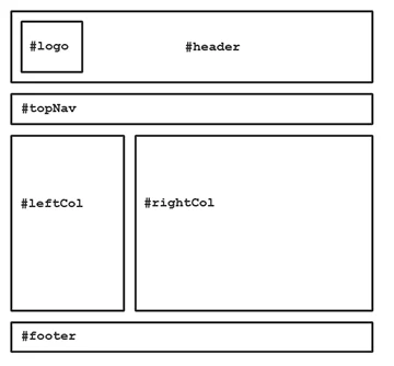
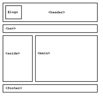
The element naming topic creates a lot of confusion, for example, what exactly is the tag <section>? It may seem as if it is another generic container, just like <div>, and is therefore misused. <section> used properly, wraps the content thematically in—yes— sections. When creating markup, it’s always good to take a look at the HTML element reference.
The most important lesson I want you to learn is that HTML semantics is a thing that everyone should care about so it’s essential to structure markup properly before styling the page.
2. Stylesheets cascade
There is a strict set of rules for how the browser determines which styles should be applied to a certain element. These fundamental features are called cascade, inheritance and specificity. The cascade is a fundamental feature of CSS. It is an algorithm defining how to combine properties values originating from different sources. It lies at the core of CSS as stressed by its name: Cascading Style Sheets (MDN). The cascading order (from styles of lowest importance) goes as:
- User agent normal stylesheets
- User agent !important stylesheets
- User normal stylesheets
- Author normal stylesheets
- Author !important stylesheets
- User !important stylesheet
As you can see, the stylesheets you create override the user agent defaults. You probably already understand the keyword !important, but we will discuss this topic more broadly in the next point. User stylesheets in the cascade refer to the styles that the user can define. A good example are stylesheets from browser plugins for reading articles in no-distraction mode. The user’s stylesheet with an !important declaration always has the highest priority.
3. Styles inheritance
The inheritance concept differs from the cascade and is basically the process of how the CSS properties are passed from parent to children in the DOM, even though they weren’t explicitly defined. Not all of the properties are automatically inherited. Here is the complete reference for CSS properties and whether they’re inherited. Some examples from the most used properties:
Inherited properties
- color
- font-family
- font-size
- font-style
- font-weight
- text-align
Non-inherited properties
- background
- border
- margin
- padding
- display
- float
- width
- height
4. Specificity
In CSS an element can be selected in various ways—by its class, ID or attribute. So when a certain element has different rules applied by a few different selectors placed within a stylesheet, how does the browser determine which selectors’ styles to apply?
Every selector has its place in the specificity order (sorted from lowest specificity to highest): Element and pseudo-element
div { } p::after { }Class, pseudo-class and attribute
.container { } .list-item:first-child { } [href^='https://'] { }ID
#users-chart { } #main-nav { }Inline styles
<ul style="list-style-type:none"></ul>Attributes with !important override the inline styles. According to the following rules—for combined selectors, specificity is calculated using the four-element tuple: For every element or pseudo-element increase the 4th item by 1
0 0 0 1For every class, pseudo-class or attribute increase the 3rd item by 1
0 0 1 0For every ID increase the 2nd item by 1
0 1 0 0For inline style increase the first item by 1
1 0 0 0Bear in mind that specificity is not base 10 but rather base infinite. Even if we’d add 9 classes to an element, it won’t outrank a single ID in the selector.
Here are two examples of how specificity is calculated:
ul#main-nav .selected-item [href=^"https://"]0 1 2 1ul.nav-wrap li:nth-child(5) a0 0 2 3I’ve already mentioned how using !important can be tricky and problematic. It’s often used to hack specificity, but in effect, it complicates stylesheets even more and makes selectors hard to untangle. How can you deal with specificity then?
- Try to keep your selectors specificity as low as possible as they’ll be easier to understand and maintain.
- In general, it’s recommended to organize selectors in a stylesheet with an increasing specificity.
- Avoid ID selectors because they are hard to override.
- Try using naming conventions such as BEM, BEMIT or SUIT.
5. Box model
The CSS box model describes the rectangular boxes that are generated for elements in the document tree and laid out according to the visual formatting model (W3C).
source: W3C
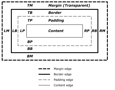
The box model is defined by properties: width, height, padding, border and margin. Although it’s possible to set negative values for the margin, you cannot do the same with padding.
The default behavior of the box model may seem a little counterintuitive. Let’s have a rectangular element described by styles:
.box-of-chocolates { width: 300px; height: 300px; padding: 20px; border: 1px solid #333; }It’s declared width is 300px and it also has a border (of 1px width) and 20px padding. One can expect that the rendered element’s width is equal with the declared width—300px. Actually, it’s 342px because the browser takes the padding and border into account so:
rendered width = content width + padding + borderThis behavior can be easily changed to be more intuitive by setting the box-sizing property value to border-box. A good practice is to declare the border-box globally because then you don’t need to worry about the calculations.
*, *::before, *::after { box-sizing: border-box; }7. How to Display in CSS
There are some basic but really important rules that describe how HTML elements should be laid out and behave. In fact, I bet you have come across the difference between the behaviour of elements like ‘div’ and ‘span’ at least once. It all comes down to the display property value. The most basic and popular values are inline and block. Inline elements behave like text—they are laid out in-line. You cannot set the dimensions or top and bottom margins for inline elements. Block elements (the default behaviour of ‘div’ elements) force a line break after the element and occupy 100% of the available width. It is also possible to set their width and height. If you require advantages from both inline and block, you can set the display value to inline-block. Here is a quick summary of the differences between the three basic display property values:
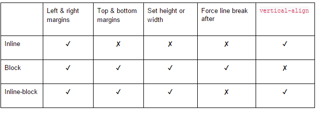
In addition to the basics, there are a lot of other display properties in CSS. You probably already know that it’s possible to hide an element using display: none. You can also make your element behave like a table—just set the display value to table and for its children: ‘table-row’ and ‘table-cell’. Here are some of the most popular display values:
- none
- inline
- block
- inline‐block
- list‐item
- inline‐list‐item
- table
- inline‐table
- table‐cell
- table‐column
- table‐row
- table‐caption
- flex
- inline‐flex
8. Positioning and floats
CSS positioning
Now that you know how elements are laid out within normal document flow, let’s talk about elements positioning. This may seem a little advanced and complicated, but all you need to know is the reference element for positioning.
Position: static
The default position property is static. The element is laid out in its current position in the document flow and the z-index property doesn’t apply.
.box { width: 200px; height: 200px; background: #14fff4; }Position: relative
Relative positioning adjusts an element’s position without changing the layout. It leaves the space for the element where it should have been when not being positioned. Also, the z-index property applies for relative positioned elements. If you’ve ever used negative margins for adjusting element position, you may think that these techniques can be used interchangeably. However, there is one major difference—negative margins pull the element in an indicated direction and don’t leave the space for the pulled element.
.box-relative { position: relative; top: -40px; left: 40px; }Position: absolute
Absolute positioning doesn’t leave the space for a positioned element and as a result, the element is removed from the document flow. Absolute positioning places the element at a specified position relative to its closest relative positioned ancestor or the initial containing block. Also note that the z-index property applies for elements with position: absolute.
.box-absolute { position: absolute; top: 0; left: -100px; }Position: fixed
Fixed positioning also does not leave space for the element, but positions it relative to the viewport. z-index property also applies here.
.box-fixed { position: fixed; top: 0; left: 10px; }CSS floats
The float CSS property specifies that an element should be taken from the normal flow and placed along the left or right side of its container, where text and inline elements will wrap around it (MDN). The CSS floats derive from the print design. Images,or any other content that needs to be highlighted, are placed in a way that text can wrap them as needed. In web design, the float property holds a similar role and can also be handy for positioning elements—pulling them right or left as needed. The main difference between floats and absolute positioning is that elements with float, remain as part of the flow of the webpage.
.floated-elem { float: right; }Floats can be used for creating entire page layouts. The other common use for them is in CSS grids.
Clearing floats
When using floats, you may have encountered a situation where the parent, containing floated elements, collapses (its height is set to zero). This is where the float’s sister property, clear, comes in handy. In general, there are several ways for clearing floats. You can use clear: both on containing ‘div’ or in an empty ‘div’ added after floating elements, but that’s an old technique. The latter one would be to make a container of floating elements a new Block Formatting Context:
- Float the element.
- Set the container overflow value other than visible.
- Set display to inline‐block, inline‐table, table‐cell or table‐caption.
- Set position to something other than static or relative.
Every one of these solutions has its drawbacks. For example, you may not always be able to set overflow: hidden on an element or change its display or position value. But worry not, there is a cleaner and simpler solution – the micro clearfix hack:
/* Contain floats and margins */ .clearfix::before, .clearfix::after { content: ' '; display: table; } .clearfix::after { clear: both; }As stated on the Fuse Interactive blog, the float containment works the same way as the traditional “clearing” approach, but avoids the presentational markup by using CSS generated content (::after).
9. Sizing units
Did you know that in CSS, you can set the element width in characters count? Yes—there are more options for CSS sizing units other than pixels and percentages. The most useful units are:
- px (pixels) represent the physical pixels on the screen so they may appear as the most reliable units for sizing.
- em represents the calculated font size of an element. It’s relative to the font size of the element’s parent.
- %
- ch has been introduced to CSS pretty recently but is now rather well supported. The char unit sets the font size of an element in reference to the width of the ”0” glyph of the element’s font. It can be useful for setting the text column width in character count.
- rem represents the font size of the document root element (e.g. <html>).
- vh represents the 1% of the viewport height. It’s very useful when you want to set an element height as 100% of the browser window. Remember to always keep the browser support in mind.
- vw is similar to vh, but relative to the viewport width.
- vmin represents 1% of the minimum value between the height and the width of the viewport.
- vmax represents 1% of the maximum value between the height and the width of the viewport.
You can learn more about other CSS sizing units on MDN.
Pixels vs relative length units
As I mentioned above, pixels appear to be the most reliable sizing unit. Still, they have certain advantages and disadvantages. Pixels have always been the faithful servant of designers. Ben Frain explained it perfectly: Pixel represents something finite, controllable, reliable. These values make it uniquely suitable for communicating lengths in documentation and providing unequivocal feedback to developers, “That padding needs to be 11px, it’s 10px at the minute”.
Pros of using pixels:
- Editing code is more straightforward (trying to be pixel‐perfect).
- No problems with compounding issues (like with ems).
Cons of using pixels:
- For responsive pages, px‐based media queries change the page experience with zooming.
- They’re less flexible than ems or rems.
Measures set in pixels are fixed and adjusting them with design changes may become a really frustrating task. Relative units (specifically ems and rems) may help to solve this problem. When using ems you must be aware that compounding 1em is the base font size and if 1em = 16px, then 1.5em = 24px. When the element’s font size is set to 1.5em, it means that it’s 1.5 times larger than its parent’s font size. Let’s illustrate it on an example:
.grandpa { font-size: 1.5em; /* 16px */ } .dad { font-size: 1.5em; /* 1.5 * 16px = 24px */ } .son { font-size: 1.5em; /* 1.5 * 24px = 36px */ }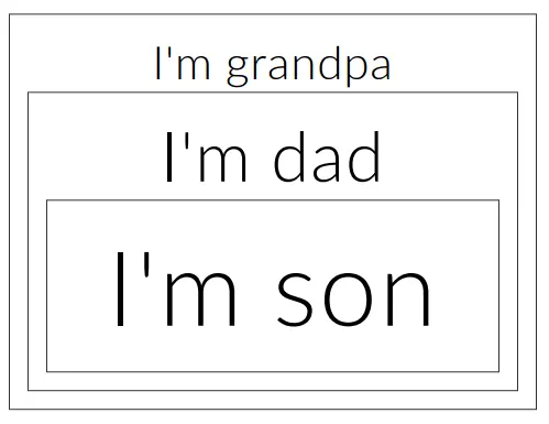
If you use them without deeper understanding, ems can quickly get out of your control. In the case of rem units, however, the font‐size is dependent on the value of the root element (or the html element). (by CSS-Tricks Almanac). Sizing with rems may seem more intuitive:
<div class="outer"> <h1>Heading</h1> <p>I'm an outer section content.</p> <div class="inner"> <h1>Inner heading</h1> <p>I'm an inner section content.</p> </div> </div>html { font-size: 6px; } .outer { font-size: 1.5rem; /* 1.5 * 16px = 24px */ } .inner { font-size: 2rem; /* 2 * 16px = 32px */ }Further reading about pixels, ems and rems:
- Font size with rem by Jonathan Snook
- Confused about rem and em? by Jeremy Church
- Just use pixels by Ben Frain
- There’s more to the CSS rem unit than font sizing by Roman Rudenko
- People don’t change the default 16px font size in their browser by Nicolas Hoizey
10. Responsive web design fundamentals
The term “Responsive Web Design” was coined by Ethan Marcotte in 2010. Nowadays, no one can imagine a website without a mobile version. So, how can you make your website look great across all mobile devices?
Viewport Meta Tag
To prepare your website to be viewed on mobile devices, it’s necessary to add an appropriate meta tag in the html ‘head’ section: A typical mobile optimized site contains something like the following: <meta name=”viewport” content=”width=device-width, initial-scale=1″> The width property controls the size of the viewport. It can be set to a specific number of pixels like width=600 or to the special value device-width, which is the width of the screen in CSS pixels at a scale of 100% (…) The initial-scale property controls the zoom level when the page is first loaded. (by MDN)
Media queries
When you hear “responsive web design”, the first thing that comes to mind is probably in regards to CSS media queries. Media queries allow us to create different stylesheets for different media types (e.g. for print). But their most popular uses are in responsive design queries:
@media screen and (max-width: 768px) { .class { ... } } @media screen and (min-width: 60em) { .class1 {...} } @media screen and (orientation: landscape) and(-webkit-min-device-pixel-ratio: 2) { .class2 { ... } }As the worldwide usage of mobile devices grows rapidly, the mobile-first approach has gained popularity. In short, it allows us to focus on designing and implementing the user interface for mobile devices. Afterwards, we can enhance it with additional information for tablet and desktop users. Overloading mobile websites with too much content can be a real pain for users with low bandwidth. With CSS code, it all boils down to choosing min-width rather than max-width in your media queries:
.mobile-first-component { display: none; } @media screen and (min-width: 992px) { .mobile-first-component { display: block; width: 100%; } } @media screen and (min-width: 1200px) { .mobile-first-component { width: 50%; } }Optimizing websites for mobile devices and implementing a responsive web design is a broad topic, something I deal with daily at 10Clouds. It is definitely too broad to fit into this short yet comprehensive article, so if you want to learn more, take a look through these other resources:
- Responsive design guide on MDN
- Responsive web design basics on Google Developers
- Responsive web design book on A Book Apart by Ethan Marcotte
» Do you want to join 10Clouds as a developer? Check out our careers page and see what our recruitment process looks like


