5 Lessons Learned at the Front-Trends 2015 Conference


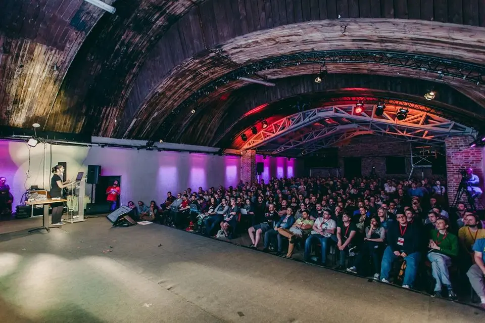
This month I’ve attended the Front-Trends conference, an annual event gathering front-end professionals, mobile devs and UI/UX designers from all over the world. The event was held in Warsaw (the venue was again the Fabryka Trzciny art center) on 6-8 May. During these three days we had an opportunity to hear many inspirational talks, meet technology experts and share our experience with a great amount of other developers attending the conference.
For me it was a fantastic experience to be there, acquire knowledge and have fun at the same time. I’ve picked some trends that I’ve found most interesting and I’d like to share them, especially with those of you who didn’t have the chance to be there.
1. CSS techniques which probably wouldn’t come across your mind
What does math have to do with CSS? This question may be answered by Gregor Adams, a front-end developer with a strong focus on CSS. Recently, he’s been enjoying himself coding fractals in CSS and SASS. In his presentation he took a step-by-step guide on how to create them. Using only a few math equations, he clearly explained how to code some examples (including the Mandelbrot Set, Sierpinski Carpet and Pythagoras Tree) and showed us a few visualizations. Some of them were enhanced by animations. In the next step he took the time to play with CSS fractal art (because it kind of looks art, doesn’t it?). Gregor showed how to combine fractal animations with the webAudio API to create visual effects with music! To be honest, no real world application of CSS fractal art occured to me, but if you need any sophisticated visualizations for your project, I’m sure you will find inspiration in Gregor’s works.
Fractal art wasn’t the only astonishing CSS technique presented. Mark Robbins who works as an email developer showed us a style called punched card coding, which means adding Javascript functionality with CSS… Wait, what? Yeah, adding interactive flavor with pure CSS is not impossible. This technique is the only way to eg. add any interactivity for e-mails received by users of e-commerce sites. It may be useful when you want to provide an e-mail with functionalities such as adding or removing items in a shopping cart. The clever idea of punched card coding is based on using radio buttons to mock javascript functionality. If you are curious how to achieve this effect, I encourage you to check out Mark’s presentation slides – they were also built using radio buttons!
2. ECMAScript 6 has landed

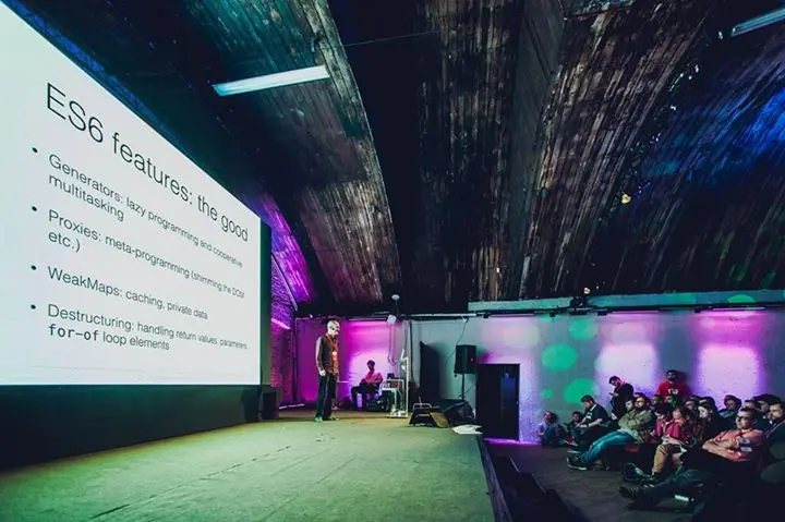
ECMAScript 6 is the latest incarnation of ECMAScript (which is most known for JavaScript). ES6 is still being adopted by developers and browser vendors and it has brought to us many of the long-awaited features like object destructuring, new syntax for classes and many more. Axel Rauschmayer is an experienced developer and book author. In his talk he covered most of the coolest and most useful ES6 aspects and demonstrated how to use them in a good way. This talk felt like a must watch for a dev who wants to stay up to date on the most recent web technologies. Thank you Axel for a very non-judgmental and comprehensive presentation!
3. UX trends
Front-Trends topics spectrum wouldn’t be complete without covering UX issues. The 2015 edition also included some interesting talks associated with user experience.
The first talk that I am going to mention was about kids. These days children begin using internet before they can even read. Trine Falbe familiarized us with issues of designing web interfaces for kids. In a very entertaining manner she showed how a child’s brain develops and how the patterns of using online tools are changing when the child is growing up. Trine described kids’ cognitive skills and explained the interaction patterns they are using. The most important lesson from her talk is: always be honest when you are designing web interface for kids and give them as much quality content as possible.
Another talk, at the intersection of UX and coding, was made by Zach Saucier, a young and ambitious front-end developer. Zach has focused on CSS animations and their meaning for user experience. He pointed the purpose of animations: they should be used to attract the user’s attention, make the experience enjoyable and convey some meaning. Animations definitely shouldn’t be meaningless, distracting or taking away the user’s control. Zach illustrated these comments by real life examples, showing us the patterns which we should follow and those we should definitely avoid. All these notices are worth considering when you are designing a modern web interface and don’t want to go into too much bloat.
4. Internet of Things
The Internet of Things idea is definitely one of the hottest trends nowadays. The possibility of connecting various devices and sensors to the Web ushers the era of automation and connecting devices of nearly all fields.

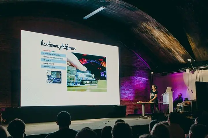
Sayanee Basu, a passionate engineer (currently working as a full-stack developer), showed us how to mashup the web and the real world utilising sensors already embedded in our phones, devices using Bluetooth Low Energy or communicating over the HTTP protocol. The talk was followed by a live demo of possibilities of various sensors, including those embedded in a smartphone. For example, we were able to see a diode changing its color according to data sent by a proximity sensor and being connected to the browser. These demos were pretty simple, but I’m sure they inspired many developers to do their own experiments!
5. Making the front-end devs community friendlier
Aside from strictly technical topics, there was also a place for more societal debate. Damian Wielgosik (former Front-Trends co-organizer)talked about soft skills in the software developer community in his presentation entitled The Human Element and asked if we are really as professional as we see ourselves. In his terms being professional does not only mean being an expert in some field, but also being a human for everyone else. He mentioned a sociological phenomenon called in-group favoritism, describing members of a certain group being favored over those who don’t belong to that group. Does this really portray us front-end developers? This question is worth asking, especially when thinking about newcomers to the community. There is an abundance of front-end technologies and tools, and I think that being a newbie makes it easy to get lost. So the main question is: do the newcomers really receive enough help and respect?
Daniel wasn’t the only person who cared about newcomers. Glen Maddern presented us with his friendlier, more powerful developer’s tool, which aims to make development process easier regardless of its user’s experience. Also, Peter Müller pointed out the complexity of our tools and proposed a simpler API, that will let devs focus on work rather than tooling. Good job, guys!
I have summed up just a few of the topics from the whole conference – surely there were lots of other inspirational talks, but there’s only so much you can cover in a single blog post. Here is a collection of slides from all of the talks. I’m very grateful to all the speakers for sharing their knowledge and expertise and the Front-Trends 2015 organizers for delivering such a professional experience of high quality. Attending Front-Trends was a really enriching adventure for me!


