Why Knowledge About Human Behaviour is the Key to great UX
17.06.2021 | 7 min read


At 10Clouds we often face UX challenges. Below you can read about some natural human behaviors that impact users as they view websites and products on websites. This blog post will show you four simple ways to take this knowledge and use it in design practice.
1. People follow gaze direction
In Unbounce’s e-book Conversion Centered Design, written by Oli Gardner, the power of gaze direction is described.
For example, when a picture of a person is used on a website, the user’s sight line will automatically follow the gaze direction of the person in the picture. The photo below provides a good example of this rule, with the heat map representing the eye movement of tested users.


(pictures from designinstruct)
Likewise, a picture on a site can also cause important information on the page to be overlooked. In the first example (above, on the top), the user’s attention is focused on baby’s face. As a result, the copy to the right is only glanced over and the text in the lower right-hand corner is almost unnoticed.
With the second example (above, on the bottom), the use of the photo with the baby looking to the right caused the user to view the page in an entirely different way. The text on the right is much more thoroughly read, including the small section in the lower right-hand corner.
The first example imposes the direction of seeing the page in a vertical manner, like two columns to be scanned vertically, while the second example encourages a horizontal way of scanning. That’s why in the second example the text is more easily read than it is in the first one.
Similarly, if we see someone staring at an object, the object becomes more important to us and we will more willingly familiarize ourselves with it.
Another example of using pictures to increase the perception of important detail is described below.


(picture from businessinsider)
Above, altering the sight direction of the woman in the picture significantly changed the way the ad was viewed. The picture on the left, where the woman is looking directly at the product, shows that there is much more chance that the product and its brand will be visualized and remembered. In the picture on the right, where the woman’s sight is directed straight forward at the user, the brand and the product are almost unnoticed.
2. People also follow lines and arrows
David Kadavy, in his book Design for Hackers, shows how lines guide our sight through any composition.
Painters and other artists over the centuries have used this feature of the human mind as well. Below you can see the painting Sunday Afternoon on the Grande Jatte Island by Georges Seurat.

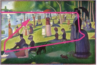
(Picture from book “Design for Hackers” written by D. Kadavy)
The composition of the painting leads viewers to look at the entire painting, with the pink line showing the sight line of most people who look at the painting. A similar response happens when users view websites that have been designed with this same consideration. It becomes easier for them to notice the most important content.


(screenshot from nicolapotts.com)
In the example above, the upper line leads the viewer’s sight line from the large heading on the left to the less expressive menu items on the right. It does this so effortlessly that the user doesn’t feel pulled to return to looking at the more distinctive heading. Likewise, the line below the heading smoothly moves the viewer’s sight line to the “Coaching” heading to the right, which prevents the user from ignoring the offer note placed on that side.


(screenshot from yousendit)
The picture above shows poor use of lines on a site. The user focuses on the dashed line and the paper airplane, which leads the user’s sight line off the page. Although the form is designed to catch attention with outstanding colors, the dashed line and paper airplane draw the user’s attention to the right and make it difficult for the user to focus on the form to the left.

(screenshot from Squared)
Above, we can observe the opposite effect. The subtle line created by the bottom edge of the credit card causes the sight line to shift to the form on the left. In this particular case, the use of the phone may catch the eye a bit too much, but use of the line works well in directing the user’s sight line to the form.
3. AIDA – The four stages of a client’s contact with a product
In Conversion Centered Design, we can also read about marketing concepts that were established before World War II. One concept describes the four most important stages of a client’s contact with a product, and this method is also applicable in modern design when we want to lead the user through a decision process. Here are the stages:
1. Attention – Our goal is to attract client/users’ attention to the page. We can do this by using a distinctive heading, pictures, outstanding colors, and general composition.
2. Interest – Next we need to maintain the client/user’s interest. We can accomplish this through interesting content or a video. Videos are particularly engaging because they forge a connection with the person speaking. They also require less work on the part of the user, whereas text must be read and therefore requires more effort by the user.
3. Desire – Once the interest is accomplished, it is time to describe the benefits of using a particular product/service to arouse the client/user’s desire to buy the product or service.
4. Action – The final stage is to have the client perform the desired task. This task could be signing up for a newsletter, registering for a new application, or buying a product. This stage works most effectively when it follows the three earlier-described stages.
Below is an example of good use of the AIDA rules in web design:


(picture from Conversion Centered Design)
4. Three other factors that increase impact on users
There are three other factors that increase a product/service’s impact on users:
1. Urgency and scarcity – Create the impression of scarcity of the product and the need to buy it immediately.
2. Try before you buy – If possible, provide a free sample of the product.
3. Social proof – Providing evidence of other users’ engagement (such as shares, comments, Facebook likes, or even the number of downloads or purchases) can increase the number of downloads/purchases.
An example of a site that uses all these factors well is Amazon.com.

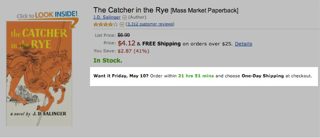
(screenshot from Conversion Centered Design)
On the subpage for every Amazon product, we clearly see, “Want it Tuesday, Dec. 17? Order within 31 hrs 28 mins and choose One-Day Shipping at checkout.”
This kind of copy creates the need of possessing something immediately and encourages the feeling of missing a chance by not acting quickly. Another common use of this rule would be through limiting the number of available seats at conferences, limiting product availability, or limiting the timeframe that a product is available at a sale price.
Amazon also gives users the option of trying certain products before buying them – for example, books often include a sample of the first several pages.
As well, product reviews provide social proof of the product and its quality. Examples of social proof factors include comments and ratings by users who have bought and used the product and can attest to its quality. Testimonials and references work in the same way and are common now, which they should be if we want to increase the effectiveness of our offers.
Another less direct way of applying this factor on websites is by offering the option of social likes and shares, which indicates that someone liked the product/service so much that they’d recommend it to others.
By applying these four principles based on natural human behavior, we can significantly increase our site’s effectiveness and impact on viewers.
Looking for an experienced team to bring your digital product to life?
Get in touch for a free consultation on hello@10Clouds.com. Our friendly team will get back to you within one working day!