Recently we wrote about the role that illustrations play in building brand identity, and now we’re going a step further to describe the important role of brand books and brand manuals. We also wanted to share with you the process of creating a brand book, using the example of one of our clients, SEEEN.
What is a brand book?
In a nutshell, it’s the visual manifestation of your brand’s mission, vision and values - its different elements combined make your brand instantly recognisable to your users.
The components that should be included in a brand book are:
- The brand name
- The logo
- An outline of the brand story
- Icons
- Fonts
- The colour scheme
- Examples of images that reflect the brand
- The form of language used and the communication style
A brand book ensures that your brand is instantly recognisable to your users. But it also has a significant use internally, as it ensures that all your staff are on the same page and know how to effectively communicate your brand through different channels
Why is a brand book important?
We’ve already mentioned that a brand book ensures that your brand is instantly recognisable to your users. But it also has a significant use internally, as it ensures that all your staff are on the same page and know how to effectively communicate your brand through different channels, and importantly, that consistency is maintained.
From a design perspective, the brand book makes things clear for designers, allowing new members to quickly get to grips with the nitty gritty of the design. From a marketing and sales perspective, it allows for consistency in client communication.
So how do you go about creating one?
Case Study: SEEEN
SEEEN is an automated video-processing and metadata generation platform. One element of our work for SEEEN was the creation of a brand book. We thought that we could use this example to guide you through the process that we went through.
1. Understanding the company’s vision, mission and current situation
We started our brand journey by working hard to understand the company’s vision and mission.
SEEEN is centred on the idea that any given moment in a video could be special. It helps users to share these special moments and makes the videos they love more discoverable.
SEEEN had recently rebranded from its former name EAI, and didn’t have any of its brand assets set up, other than the logo, which had already been created by an independent designer.
2. Establishing the client’s need
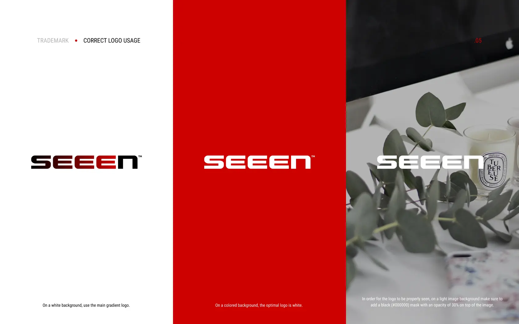
The client wanted to understand how to use the existing logo in different contexts - i.e. against backgrounds of various colours and alongside other brands, when communicating about partner initiatives. They also wanted us to create a presentation template for the company, covers for social media and email signatures.
3. Logo - how to use it and how not to use it
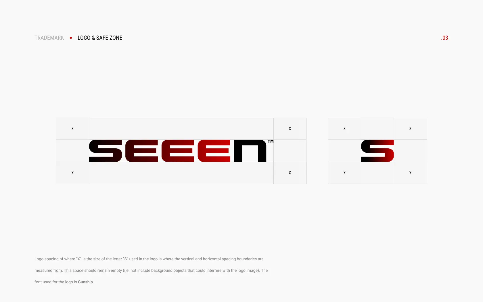
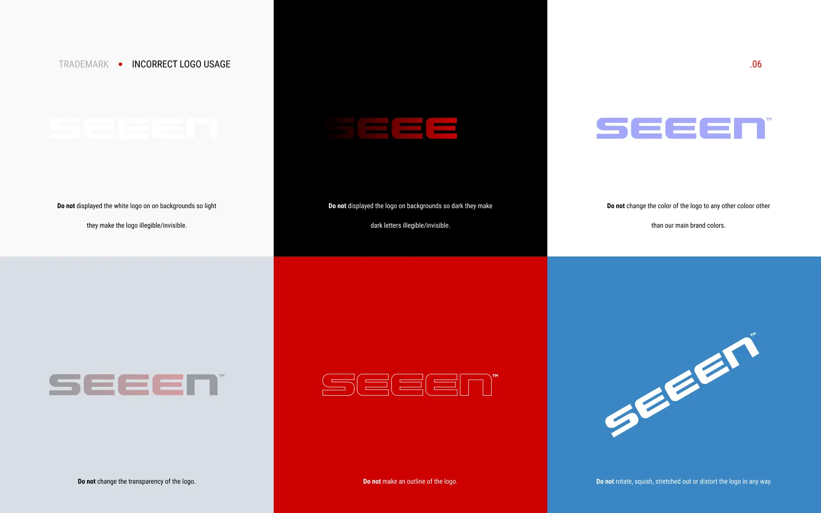
In the brand book, we clearly outlined the uses of the logo including details such as padding. Importantly, we also gave example scenarios of what not to do, to encourage consistency among all members of the internal team. Finally, we rendered the logos in 3D.
4. Adding a textured background
The client was keen to use a textured background, so we created this to suit the existing brand assets.
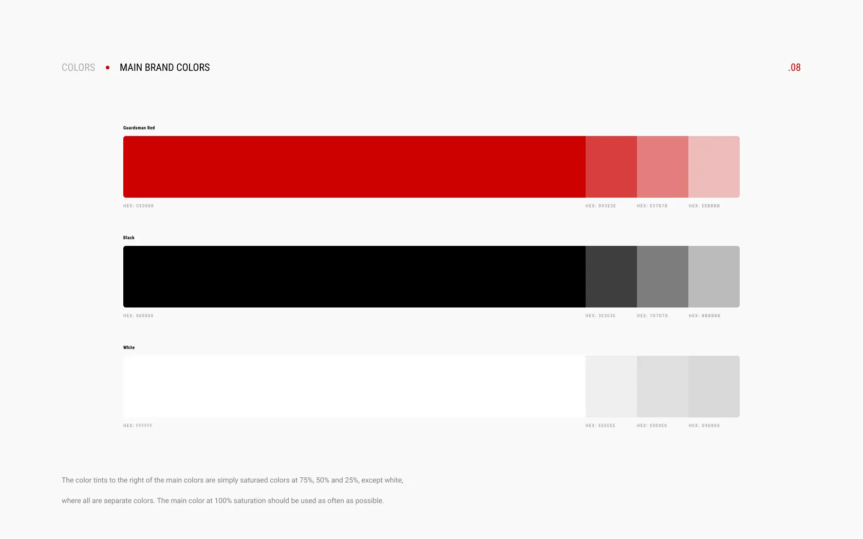
5. Setting defined colours
SEEEN previously didn’t have its own defined brand colours, so we set these and explained how these should be used in different contexts and against various backgrounds.
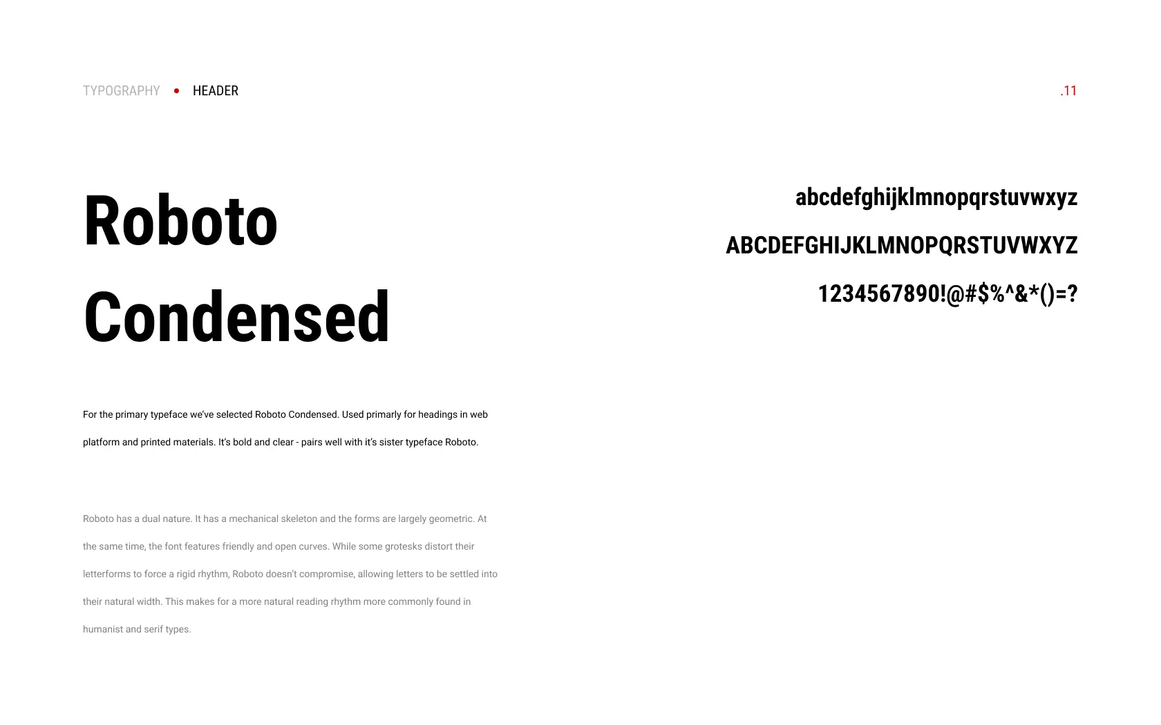
6. Setting the fonts
The client previously only had one font which was used in the logo and headers. We added a second to add variation and better legibility for standard paragraph text.

7. Last but not least - the brand imagery
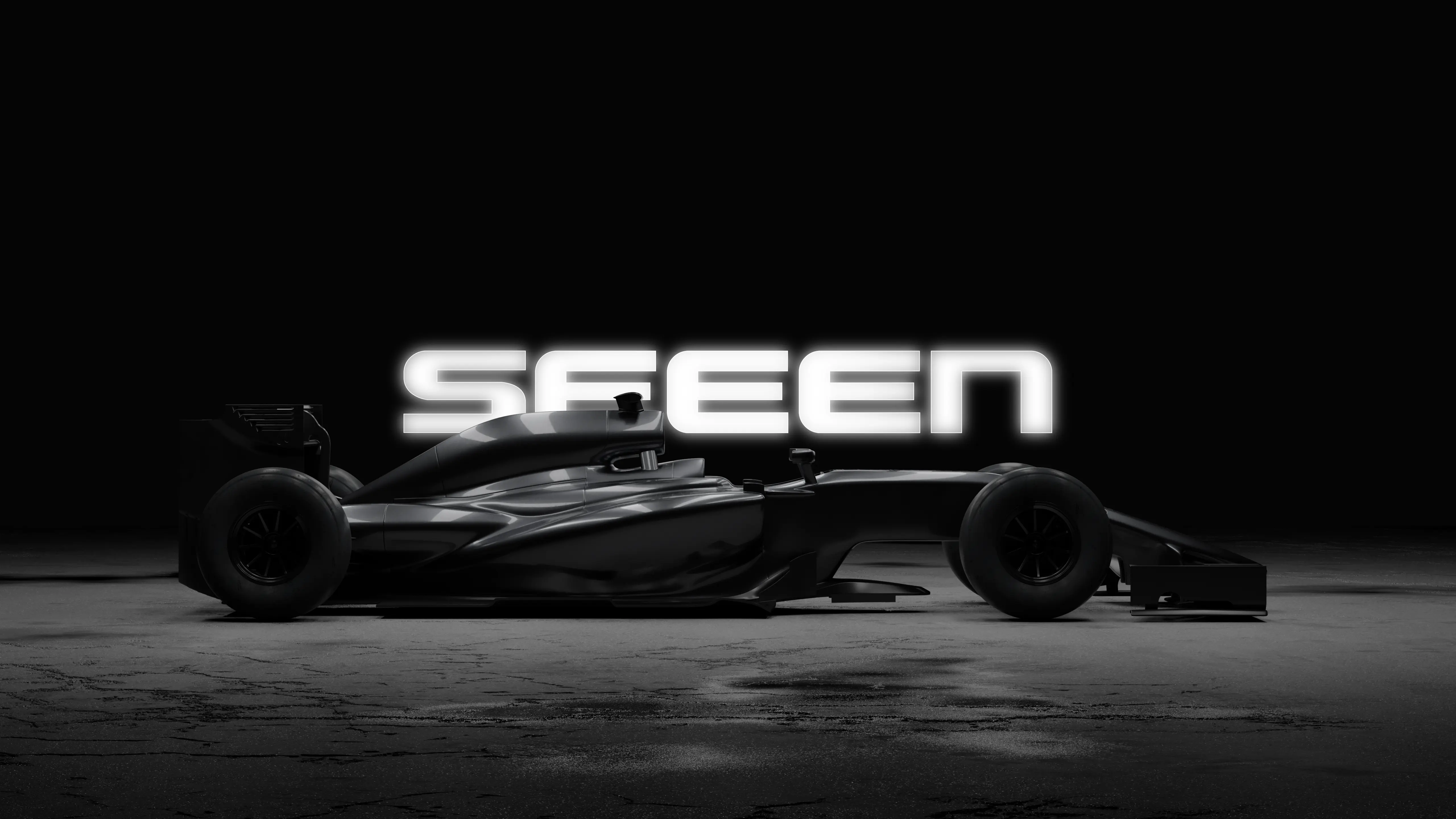
This was designed by our Senior Illustrator, whose 3D image of a racing car ideally suited the brand’s look and feel.
What’s next?
Coupled with the client’s own communications guidelines featuring the form of language used and the communications style, SEEEN is ready to send its brand into the world. We wish them every success!


