Avoid Making this Common Mistake when Designing Mobile Apps
27.01.2015 | 4 min read


Continuous growth of smartphone screens is becoming the most obvious trend in the market. Manufacturers push for ever-larger devices, with 5-inch phones quickly becoming the norm (while not that long ago 4-inch phones were considered to be big).
According to research conducted by Flurry, the big-screen phones quadrupled their market share during the past year.
This reality creates a lot of opportunities for the designers, but it also comes with new, unique challenges. To keep up with the industry we have to review established solutions and make sure we deliver the best experience for our users.
Designing Mobile Apps for Increasing Screen Sizes
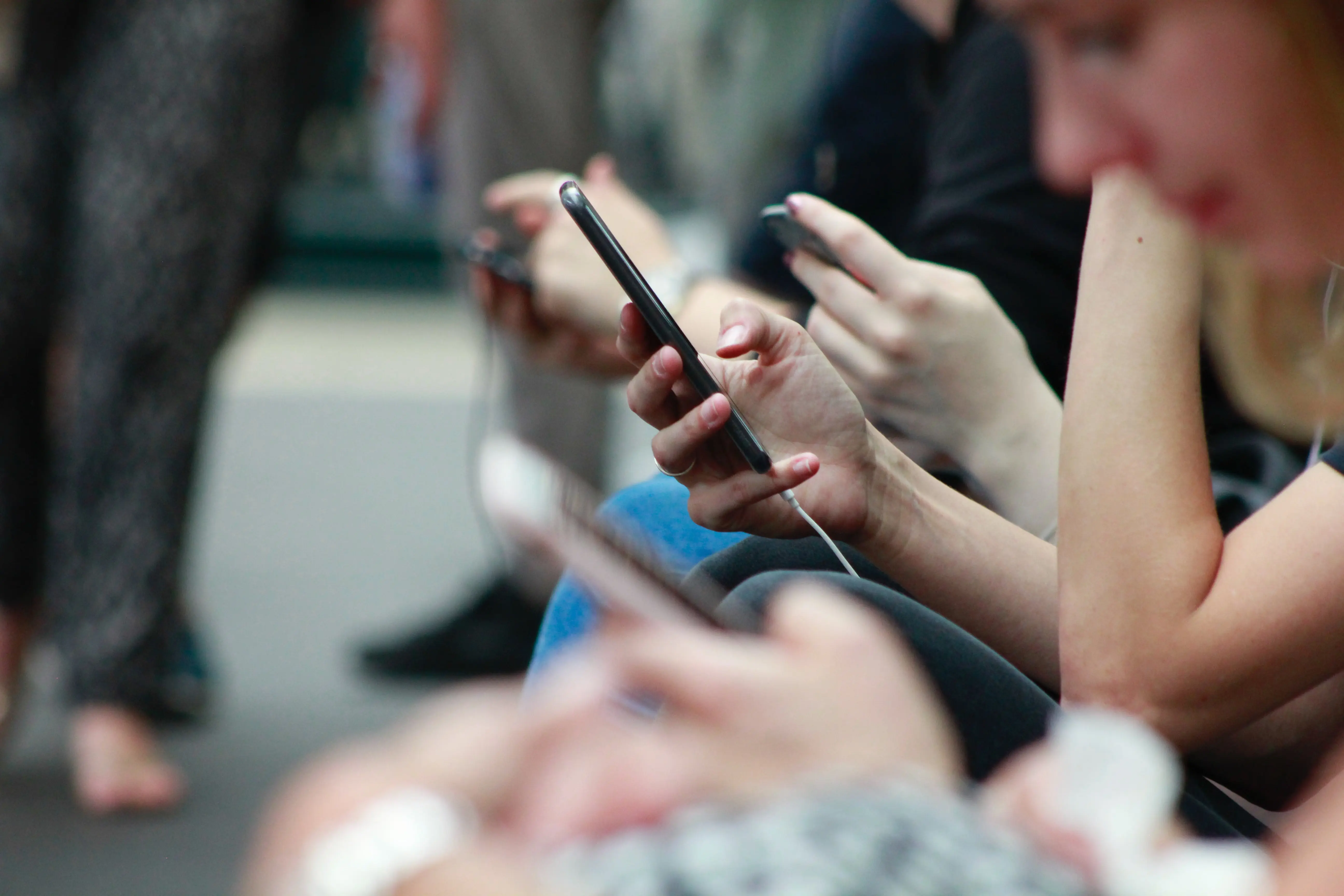
When designing the best mobile experience it’s essential to consider the way people hold mobile devices.
According to Steven Hoober we have grown used to one-handed use of our smartphones. Over 80% of observed people used their phone single-handedly, sometimes using the second hand as a support.
The map below shows in green the approximation of the area that can be reached easily that way – the thumb zone. Elements placed outside of this zone require you to stretch or even change your grip.

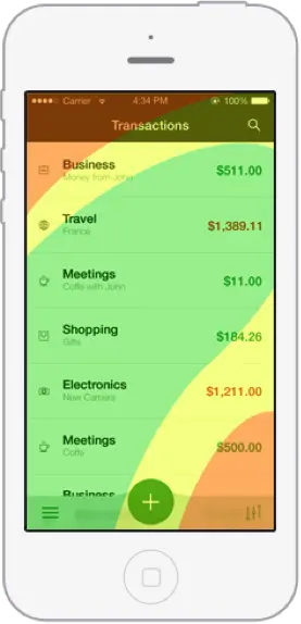
“Thumb zone” – the most convenient area to reach without repositioning your grip
Placing frequently used options just out of reach of our thumbs is becoming a very common mistake. As a consequence, phones are becoming less convenient to use single-handedly.
Bigger screens encourage us to use our devices more. We spend significantly more time consuming content, which proves that smaller displays were somewhat limiting.
In result, element placement becomes an important issue, since we are using our phones more than ever.
Rethinking Drawer Menu
As phones grow bigger the top of the screen is getting farther away from our thumbs. In result a problem arises, when it comes to using the most popular navigation pattern – drawer menu.
I was thinking about proposing my own take on the drawer menu for a while now. Its most common placement, the top-left corner, sometimes proved to be hard to reach for me, even on 4” screen. It never struck me as that much of a problem, though.
But now, when we also consider the fact that as the phone screens grow it becomes even harder to reach, suddenly this turns out to be very interesting problem to tackle.
I decided to take a shot at designing a version of drawer menu that is more accessible on bigger smartphones. It was important for me to create a convenient way to switch between views and to draw users in with an engaging experience.
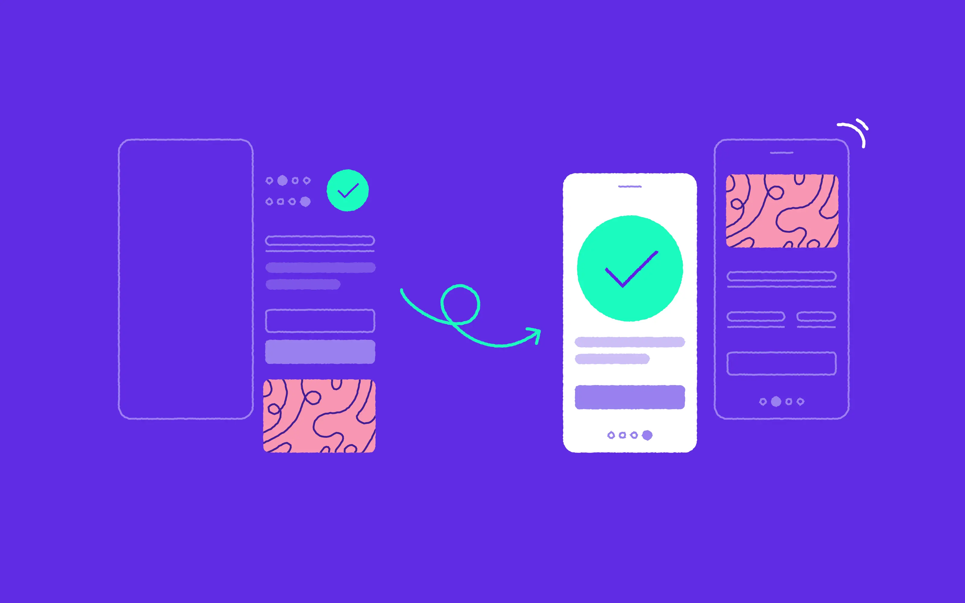
Continuous Touch Menu
Following those newly formed constraints has led me to some interesting results, presented on the video below.
Keeping in mind the thumb zone, moving the menu icon to the bottom of the screen was the first step I took. Of course the bottom positioning wouldn’t be a relevant improvement if the most important options remained at the top. Aligning them to the bottom of the screen was the natural next step. I also introduced the animation delays to clearly communicate to the user that the order of options is reversed.

The animation delays suggest that the most important options are located at the bottom.
In consequence, moving the menu icon to the bottom of the screen was the first step I took. Of course the bottom positioning wouldn’t be a relevant improvement if the most important options remained at the top, outside of the thumb zone. Aligning them to the bottom of the screen was the natural next step. I also introduced the animation delays to clearly communicate to the user that the order of options is reversed.
These modifications made the menu very convenient to use. To make it even more intuitive I added an edge swipe gesture as a way to open the menu. And this, in turn, inspired me to provide an additional way to use this navigation – with a one continuous gesture.
Gestural interfaces have a great effect on the experience by making the app feel comfortable and natural. They work especially well on the big-screens, as they don’t require as much precision as tapping, allowing you to perform actions from the spot that is the most convenient for you. In short – they provide a physical comfort.

Of course due to the low discoverability, the most obvious problem of the gestural interfaces, the menu can also be used through tapping. This makes the interaction a form of an accelerator.
Enhancing the tap interaction like this saves time during frequent actions but, more importantly, it makes the application feel more responsive.
I believe that the direction in which the smartphones’ market is heading creates many challenges, things we have to consider and problems to solve. But at the same time, it creates an interesting opportunities to delight our users.
That’s why it’s important to sometimes simply take a step back and think, what could be done differently when designing mobile apps.