Product Camp 2015: UX From a Visual Designer’s Perspective
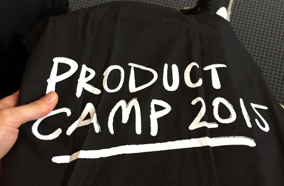
Product Camp 2015 was a real pleasure. The atmosphere, knowledge, people and place! All of them made me feel the creativity flowing in the air, mixed together with a wonderful sea smell in the fantastic port city of Gdynia, Poland.
To be perfectly honest: I was there because of the event branding created by the absolutely stunning design studio LESS. The girls behind the studio are making great minimalistic stuff, but in a totally different way than usual. The color and typography contrasts are so powerful that you just can’t miss it! Therefore, the decision to go was a really easy one and I booked myself into the Pendolino high speed train and went on a great trip to the Polish seaside.
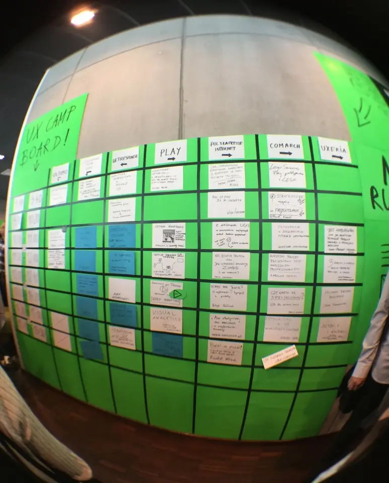
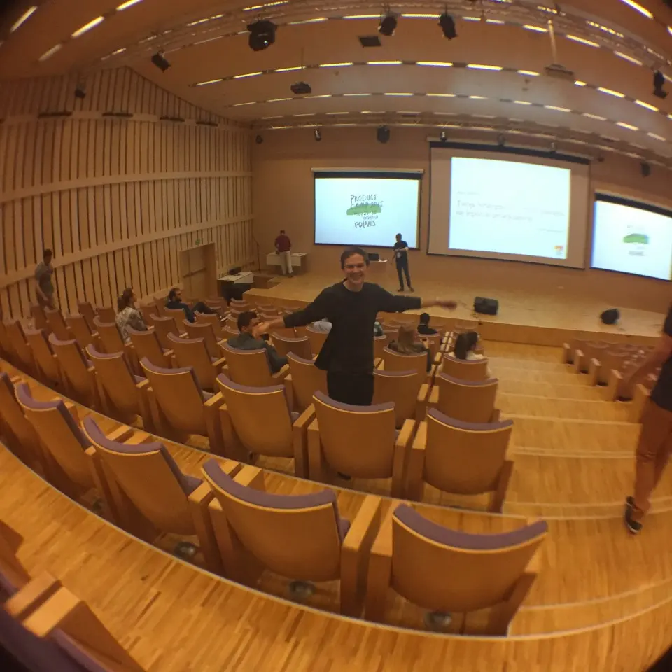
Arriving in grand style I was welcomed by seagulls and a fresh summer breeze. Product Camp 2015 was hosted in the Centrum Nauki EXPERYMENT, which itself is a very interesting building and a good fit for such a conference. The setup was very interesting: before each lecture, the speakers presented short “sales pitches” of themselves and their topic, and based on their persuasion skills we had to make a snap decision what topic to choose. As a result every participant was designing his or her own conference roadmap, with an element of danger of making the wrong choice – no risk no fun!
Burger – no thanks
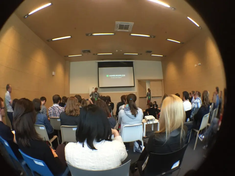
Because of Łukasz Przywarty I’m a hamburgerless person now! For a graphic designer like me it is truly unbelievable that people still don’t recognize the hamburger menu icon. Łukasz told us an interesting example of this fact when telling us that his sister thought that this icon was a Sephora logo. Visual symbols are extremely important in User Experience and Visual Design, but I agree with Łukasz that we should leave the burger menu behind. Swipe or flat navigation could be an interesting solution, but nothing is perfect: often users don’t even know that these types of possibilities even exist. The navigation is a big problem in mobile design and Łukasz showed us good and bad sides of every alternative. While I was at the conference, a new solution appeared and was published on Twitter: the backburger icon. I’ll leave the decision if it is a better option than the hamburger icon to you!
Messed up Wi-Fi
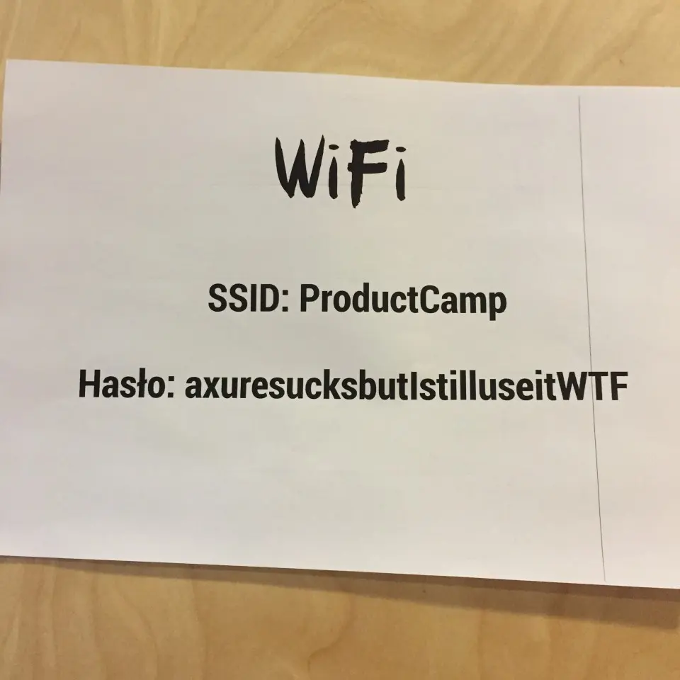
Not everything was user friendly at Product Camp 2015. The wifi password was extremely difficult to type in, which was a joke from the organiser that I didn’t find funny at all ;-). I tried it 3 times but gave up and used my 3G connection, a good way to save on bandwidth I would say!
Jessika + Joanna
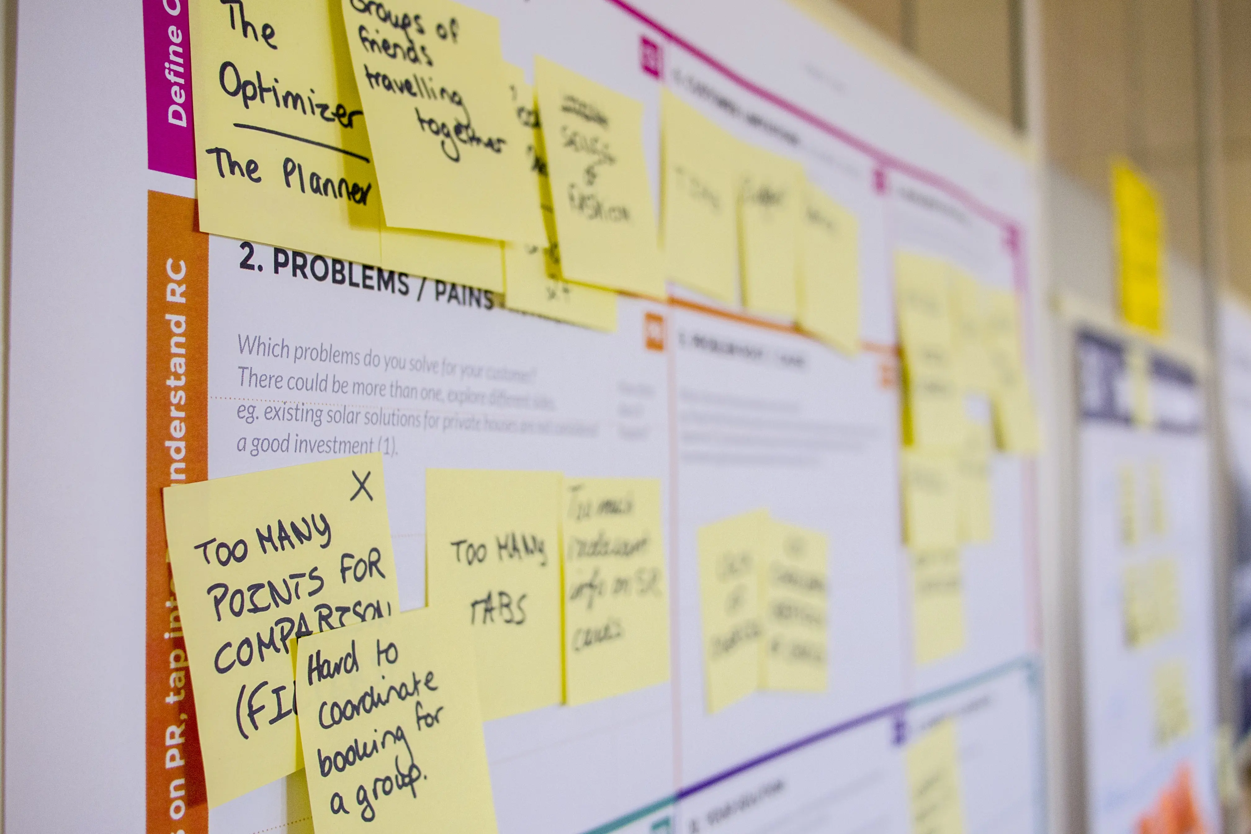
The girls were designing an application for the Polish government – serious and difficult stuff. The problem described was the user testing done by the officials and workers of this institution – the people were not very cooperative and there was a lot of bureaucracy. Everyone called each other Mr and Mrs (Pan i Pani) and were afraid of the verdict of their superiors, which made the analysis very formal and official. It’s not easy to call your boss by name in Polish public institutions and the girls suggested to make an experiment: during the trials, everyone was to call each other by name and it actually worked! The tests were more efficient, which confirms the theory that simple ideas are the best ones!
Conclusion
Product Camp is for every one who is interested in interactive stuff. And you know what? I think this event is even more useful for non UX people than product designers. So visual designers – see you next year!