
Research shows that the average person is exposed to more than 5,000 brand messages every day. Among this noise, there are several successful brands which really stand out. All around the world, people recognize Google’s colourful logo which often forms the centrepiece of their screens, Coca-Cola’s slanted letters written in Spencerian script, and Nike’s tick. But even these big names have gone through several rebrands over the course of their existence. Why did they decide to invest in rebranding campaigns and what benefits did these changes bring?
First things first - what is a rebrand?
Rebranding is the process by which the corporate image of a company is changed. As part of it, a new logo, font or colour scheme is created for a pre-existing brand. Often the key driver of a rebrand is the desire to create a new identity for the company, to differentiate it further from its competitors or to give it a new, fresher feel.
Rebranding is the process by which the corporate image of a company is changed.
Reasons for rebranding
1. Proactive rebranding: this is when a company realises that their current brand may no longer be effective in attracting the customers that it is after. Their customer profile might have changed over the years, there may have been developments in their product or service portfolio, or times may have simply moved on. Often it’s a combination of two or more of these factors. Quite simply, the company realises that a rebrand would enable them to expand, innovate, win new business opportunities or reconnect with past customers.
2. Reactive rebranding: this is when a company’s existing brand has been ceased to exist, or has been changed. This might happen due to a merger or an acquisition, a change in legal status, or negative publicity associated with a given product or event. In these situations the company chooses to leave behind its former brand and reemerge on the market with a new one.
Major company rebrands and what we can learn from them
1. Wendy’s international fast food restaurant chain
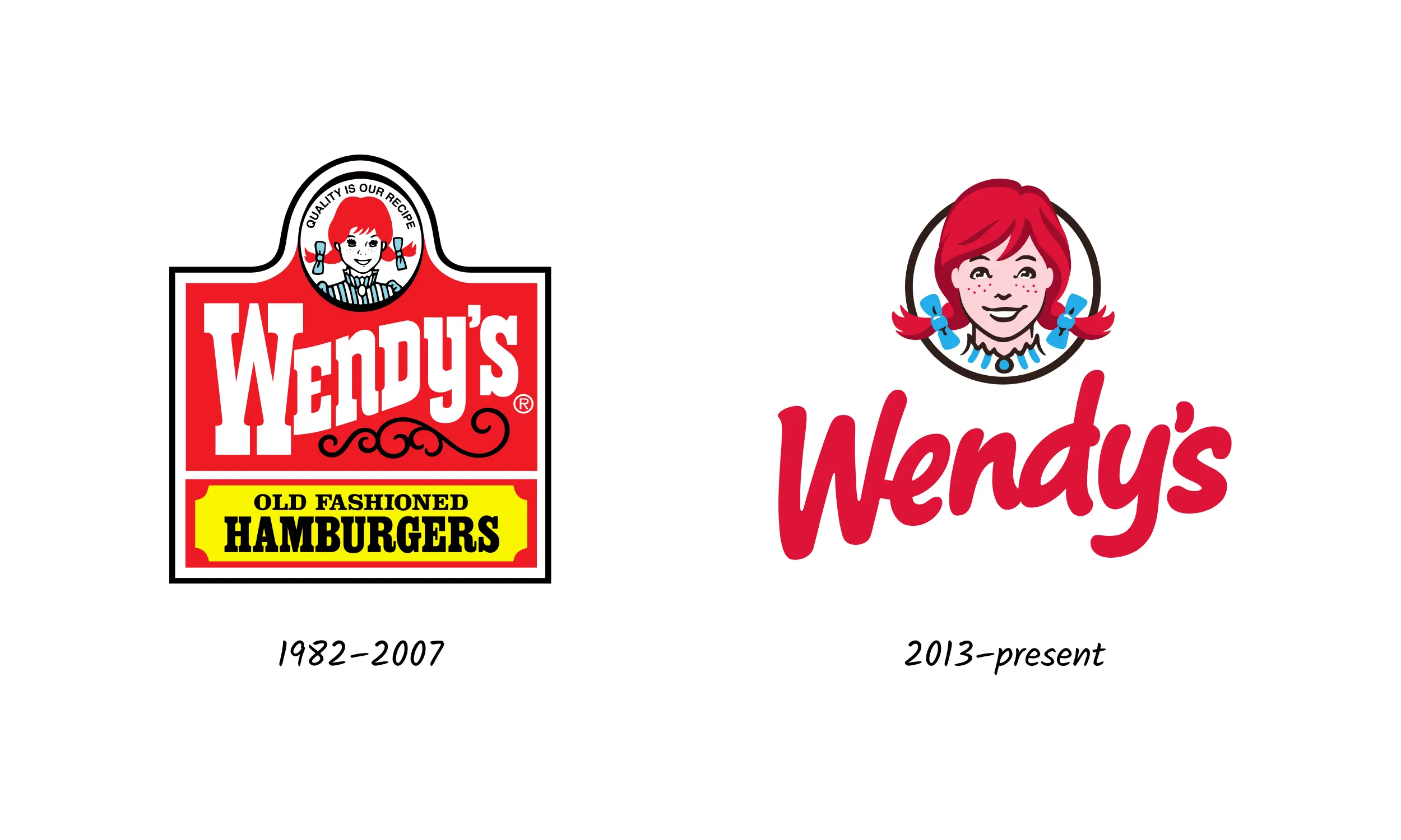
Wendy’s is a fast food chain founded back in 1969 in Columbus, Ohio. The chain is known for its square hamburgers, sea salt fries, and Frosty, a form of soft-serve ice cream mixed with starches.
Amazingly, for more than four decades, the branding remained more or less unchanged. The logo that you can see featured below, was only a small variation on the previous one, and remained in use until 2007.
Previous brand: A fairly ‘busy’ and text-heavy brand which featured cowboy-style slab, serif typography and the well-recognized image of a young girl with red hair and pigtails.
New brand: Gives a much needed visual boost with more modern, breezy font, simplified design, but keeping the image of the pigtailed girl. Note that the new Wendy gets a closer crop, subtle shadows for depth (look at the hair) and an eyelash clipping.
Lessons learnt: Wendy’s shows how you can remain authentic and stay true to your heritage, while at the same time modernizing your look and feel. Representatives at Wendy’s reported that the new logo signalled the innovation and fresh thinking taking place at Wendy’s, while reinforcing that the company was staying true to its values.
2. Deliveroo - UK-founded food delivery company
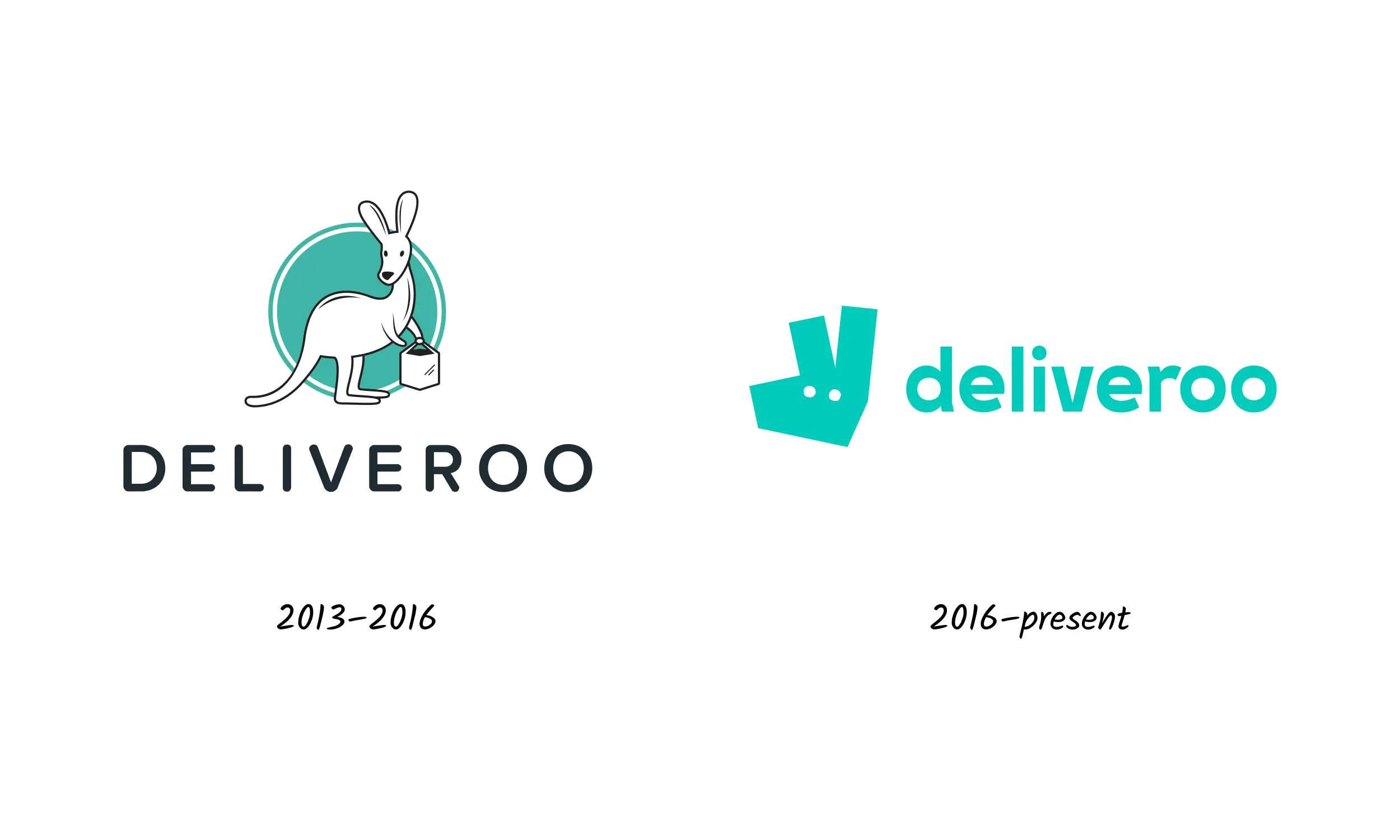
Deliveroo is an online food delivery company founded by William Shu in 2013 in London, England. It has since significantly expanded its operations, to cover not only the UK, but also the Netherlands, France, Belgium, Ireland, Spain, Italy, Australia, New Zealand, Singapore, Hong Kong, the United Arab Emirates and Kuwait. The brand’s major challenge was to adapt to the growing international market, while at the same time staying modern, recognizable and relevant.
Previous brand: The initial logo had an overly complicated graphic with many shapes, colours and symbolism.
New brand: The kangaroo image has been transformed into a symbol, which is much easier for the brain to process.
Lessons learnt: Deliveroo’s brand application has been well thought through, with the entire brand being in one colour. A clever by-product, is much better visibility for the delivery team.
It’s a great way of building an international brand, which is more accessible and easier to remember.
3. IHOP (International House of Pancakes)
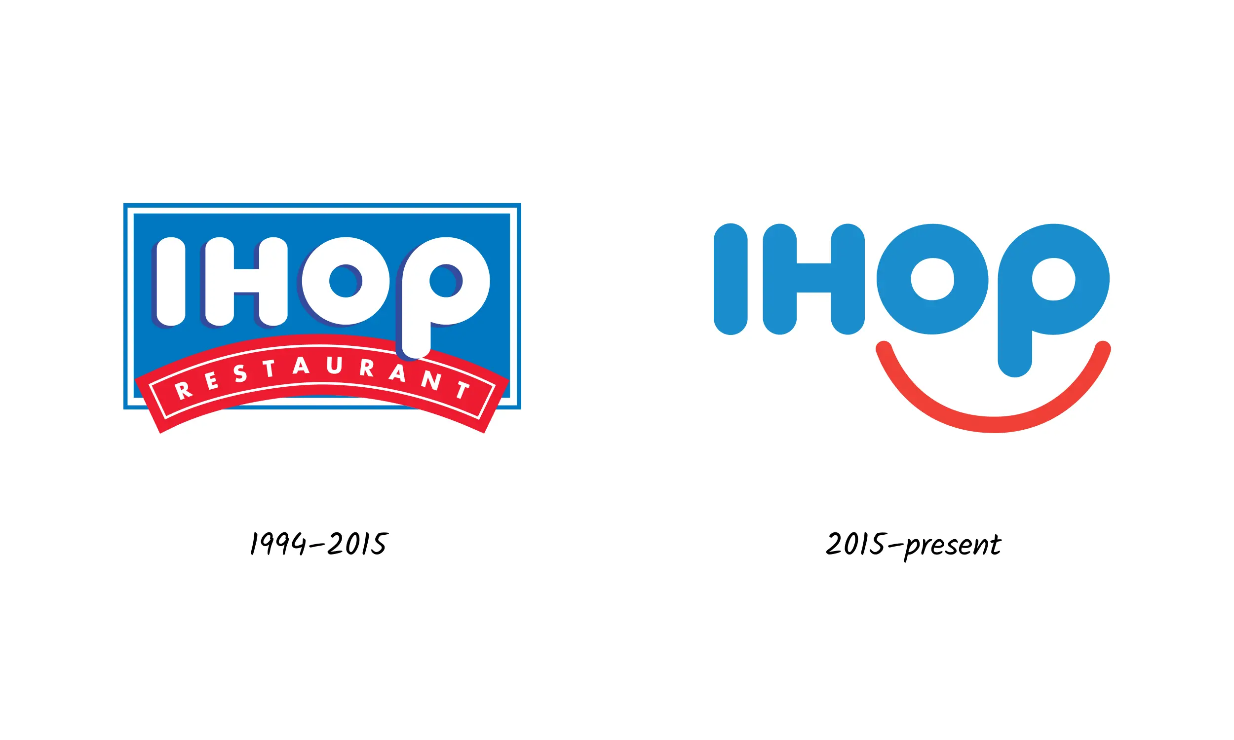
IHOP (International House of Pancakes) is a pancake restaurant chain which originated in The States and has recently redesigned its logo after more than two decades. The new logo was designed by Studio Tilt. The brand was looking to appeal to a wider audience and to refresh its look and feel.
Previous brand: Aside from the fact that the previous brand was over twenty years old, it also featured the word ‘restaurant’ within a frown-like shape, which gave it a negative vibe. The new designers were looking to quite literally turn this around.
New brand: The new brand builds in elements of the previous logo with its easily recognizable color combination, shapes and fonts. The frown has been turned upside down into a smiley face - a feature which has been carried through various elements of the branding. IHOP has even created new marketing campaigns capitalizing on their new happiness-focused brand, such as the #IHOPSmile.
Lessons learnt: The biggest success that IHOP has shown us is how to make your disadvantage your niche and how to effectively build brand value from a logo that is steeped in history.
4. Gumtree
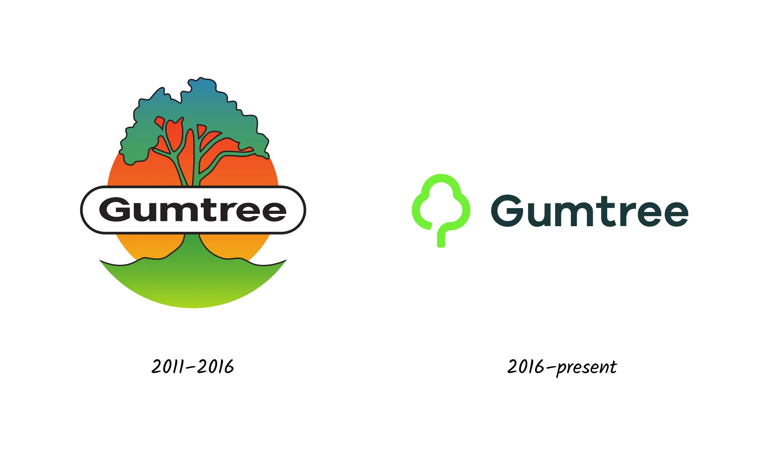
Gumtree is an online classified ad company and community website which has since expanded into the international arena and is now widely used across Europe. The name of the brand goes back to its original vision and mission, which was to connect Australians, New Zealanders and South Africans who had recently moved to the UK.
Previous brand: The original logo featuring the gum tree that is common in South Africa and Australia was designed to reflect the roots and branches of a real community. However, the original typography looked flattened and the logo was non-responsive, which meant that it was difficult to scale to smaller screens and documents. The wide range of colours featured could confuse consumers when it came to brand recognition.
New brand: The new brand has been significantly simplified. The typography has been modernized, but is still in keeping with the previous fonts and styles. The shape of the new symbol, also refers to the old logo, which means that brand consistency is maintained.
Lessons learnt: The key takeaway here is to stay true to your identity when modernising your brand, especially if it has worked for you for a number of years, and its the image that others associate with what you do.
And two examples of when a rebrand really didn’t work out...
5. The Gap
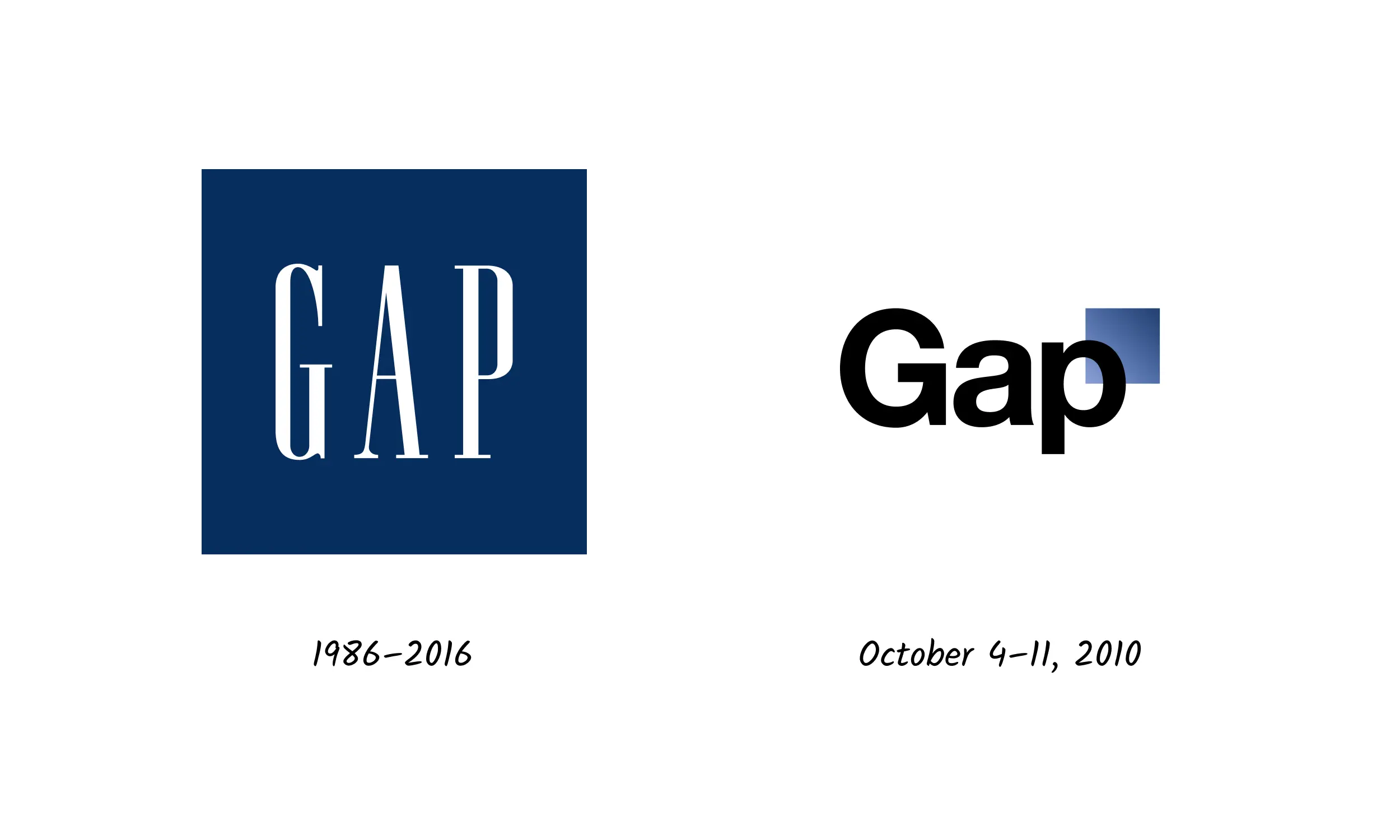
The Gap, Inc., commonly known as Gap Inc. or Gap, is an American worldwide clothing and accessories retailer founded in 1969. For many decades, its logo has remained unchanged, but quite suddenly on October 4, 2010, Gap replaced its classic blue square logo with a new one - black Helvetica font on a white background which was reportedly designed by the agency Laird & Partners.
The change was very badly received by customers - so badly in fact, that on October 11, only one week after it had been introduced, Gap announced that it would be reverting back to its old logo.
Previous brand (later reverted): A very simple, traditional brand in classic serif font with well recognised colors.
New brand: The typography was changed from classic serif to modern san serif, and also amended from upper to lowercase. The closed typography on a square was opened and overlapped on a small gradient square.
Lessons learnt: A rebrand is not always needed! It’s always good to make changes based on customer reaction, or to test your suggested rebrand among your pool of target consumers. The new logo here was associated more with a technology company rather than a clothing brand. The rebrand was also too abrupt and unplanned.
6. Animal Planet
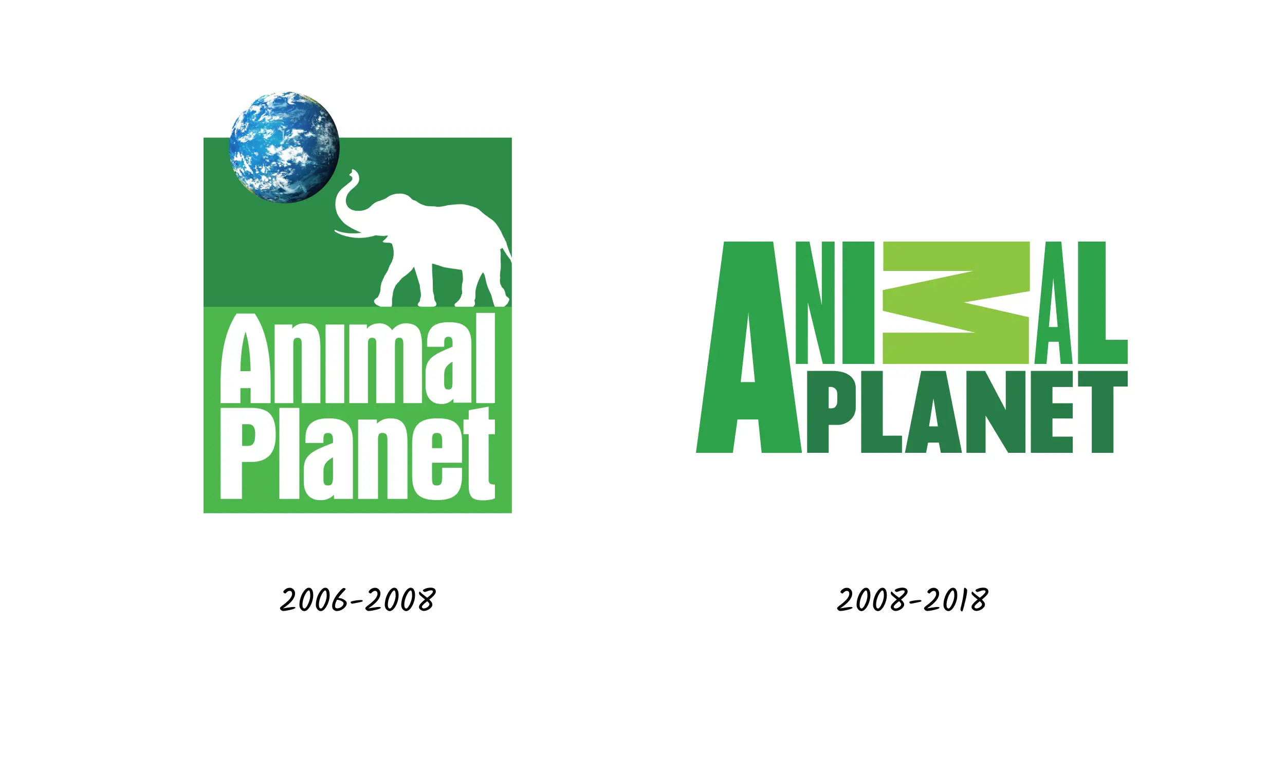
Animal Planet is a paid wildlife TV network owned by Discovery, Inc. and first established in October 1996. In 2018, the company underwent a rebrand which altered the logo completely and led to a very disappointed response from viewers.
Previous brand: The channel’s classic and very popular logo featured an elephant under a small planet earth in the upper corner. It was instantly recognizable and alluded directly to the channel’s content.
New brand: When the rebrand took place in 2008, the new logo featured the channel’s name with the “M” in animal turned sideways. Viewers reacted negatively, feeling that it was messy, chaotic and perhaps most ironically - unnatural.
Lessons learnt: While the previous logo was easy to understand with a clearly established motif that had been around for years, the new logo only led to confusion. It’s therefore important to always remember about keeping a clear link between the brand’s mission and its content, and relatable brand elements.
Conclusion
We hope you found the above examples interesting! In summary, there are several key points to consider when planning your rebrand:
- Consumer feedback - conduct qualitative and quantitative research on a small sample of your audience to see whether your new brand works for them
- Keeping your identity - your new brand should reflect your heritage and the identity that you’ve built up over the years.
- Simplification - One thing that almost all successful rebrands have in common is that they have simplified the various elements of their brand to make themselves stand out to their consumers and send a clear message about their vision and mission.
Header photo by Tamarcus Brown on Unsplash


