Building an air pollution tracker app: The UX journey
07.01.2021 | 5 min read


We sadly know that air pollution is a growing problem for many cities around the globe, not only in countries such as China, India and Pakistan, but also in several European cities. Air pollution has been linked to higher rates of cancer, heart disease, stroke, and respiratory diseases such as asthma.
Tracking systems play an important role in helping us not only monitor the level of pollutants in the air, but also ensuring that the most vulnerable people in our society are able to stay indoors when the level of pollution exceeds a safe threshold. This is why we decided to launch an air pollution tracker app, free for everybody to use.
Below, we take you on the creation journey, to show you why certain UX decisions were made and our motivations behind them which might be useful to you if you’re planning to create a similar weather-style app.
Creating the user flow for a simple weather-style app
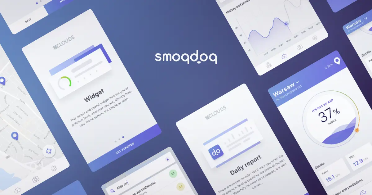
1. Fast onboarding
Our primary goal was to quickly get users interacting with the app. That was why we skipped the registration and login screens and instead focussed on building a simple tutorial which explains what the app is about and how it works. This was in the form of a simple three-step swipe through which users can go through in more detail, or just bypass and go straight to ‘Get Started’.
2. An intuitive main screen
We wanted the main screen to give the user an at-a-glance view of important data. This is why the most prominent piece of information is related to the current pollution level and how it measures against the acceptable thresholds, using a colour chart - from green (good quality air) through to red (a high level of pollutants). Importantly, we also wanted to show the distance to the nearest trackable air pollution station so that users could see the accuracy of each reading.
Highlight your app USP here: If your app has an obvious USP, it’s important to communicate this to your users from the outset. Ours was the machine-learning based 4-day pollution prediction, which we knew that other competitors on the market didn’t have, so we were sure to tell users about this both on the tutorial slides and on the home screen.
3. Swipe down for the daily report
The Daily report in the app gives users a more detailed overview of not just the air quality for the given day, but also the air pollution history for the given area and predictions for the future. These are displayed in the form of an easy-to-understand line graph, split out into different levels of pollutants and coloured using the same green-to-red scheme as that used on the main screen - in order to quickly showcase which pollutants exceed the agreed threshold.
Important point about data presentation: Simplify your data and make sure that your units are uniform. We found, for example that the units of pollutants used by governments across Europe and the world differed significantly. In order to ensure that their levels were understandable and easily-comparable, we decided to set our own scale which would be much more user friendly.
4. The search function
For users planning a trip, or those curious about the level of pollution in other areas, we created a smart search map which shows the details of pollutants in other places. Users have the ability to search via address or postcode, or to simply move the map into their desired location. Again, we mapped all of the air pollution stations onto the map, in order to give users an at-a-glance view of how far they were from the nearest one.
User testing
We only conducted qualitative user testing in the early stages of app creation, but the really interesting data came from the app store, once the app had already been downloaded by several thousand users. We found that upon downloading, the vast majority of users did not end up continuing to use the app on a daily basis, in the way that we’d expected. Further research revealed that what would actually be most useful was a widget, which users could just swipe every morning on their phone.
Developing the Widget
The widget has now been developed for both iOS and Android, and allows users to quickly check the current and predicted pollution levels in the area in which they find themselves. Easy!
But this is just the beginning…
As this is our first time working on a project of this kind, we decided that it would make most sense to create an MVP first, with a limited number of features included in the first iteration of the app. We want to first of all conduct further user testing to see how users interact with various elements of the app and which future elements they would like to see. The app only currently collects data from Polish air quality stations, but the goal is to expand its reach to cover other European cities in the future.
So what’s the key advice?
When creating a weather app or similar, we would advise that you quickly guide your users through how it works using a quick tutorial, make sure that your data is digestible and easy for all to understand, and ensure that you continue testing to see how your users respond to your first iteration. You may discover (as we did with the widget) that there is an obvious solution which you didn’t initially consider.