UX writing: 5 tips for creating engaging content
02.10.2020 | 4 min read


Earlier this year, we wrote about the important role of the UX writer, who is responsible for all the words that a user encounters when interacting with a website or app. Their role is to explain how a product works and to help users achieve their goals within it.
A recap: Why is UX writing important?
Put simply, on many websites and apps, content is critical for converting sales, establishing a consistent voice for the brand and generally driving the user experience.
The lack of effective UX writing could be the difference between a successful product, which users understand and enjoy using, and one which they feel they don’t want to devote their time and money to.
But how do you create engaging content?
This is a many-sided question, which like most things in UX design, leads back to effective research into your target audience. But we’ll also cover how you can iterate and improve on your copy in order to make it as effective as possible. Remember that when it comes to effective UX design, nothing is ever final.
1. Research the intended actions of your target audience
Author John Locke states, “In my opinion, understanding who your target audience is, and what they want, and writing to them (and only them!) is the most important component of being successful.”
While he is alluding to the work of an author, the same applies to product design. When beginning to write, it’s helpful to ask yourself a couple of simple questions:
- Why and how did the person reach the current screen?
- What would they like to do next?
- What action would you as the product owner like them to take?
- Does the above translate into a clear Call to Action on the page?
It’s also useful to think in terms of user flows, not only from one action onto another, but through the entire app or site. Many UX writers work closely with UX designers on the overall ‘mapping of the product’ - this is also helpful in ensuring consistency of brand voice and tone, which brings us onto the next point.

2. Use a consistent brand voice
Consistency is king when it comes to UX design, and it goes hand in hand with simplicity. The simpler your instructions and calls to action are, the more readily your users will follow them. Some of the below points might sound obvious, but they’re vitally important when it comes to a successful user experience:
- Use the same words to mean the same things in all areas of your product - e.g. don’t use ‘Buy now’ and ‘Reserve your product’ interchangeably. This will only cause confusion.
- Make your calls to action as simple and succinct as possible, but not at the cost of losing meaning - some product owners aim for such simplicity of language that they might end up achieving the opposite result, with users unsure of what they should do next.
- Ensure that the way in which you engage your users is in line with the company’s overall tone and style.
3. Use language appropriate to your target audience
This links back to the two points above, but is important enough to warrant a separate mention. A thorough analysis of your target audience (not just for UX purposes, but generally), might have led to you drawing up personas to get down into the nitty gritty of different character traits.
If it turns out that you have two or more distinct personas, you might consider creating separate user flows for each of them, which will use different language and calls to action.
We’ve already mentioned that it’s important to get into the shoes of the user, but it’s useful to go one step further and to understand their mood at any given moment of the process, and to write empathetically.
E.g. if at any point they’re likely to be feeling unsure, your language should be reassuring and supportive.
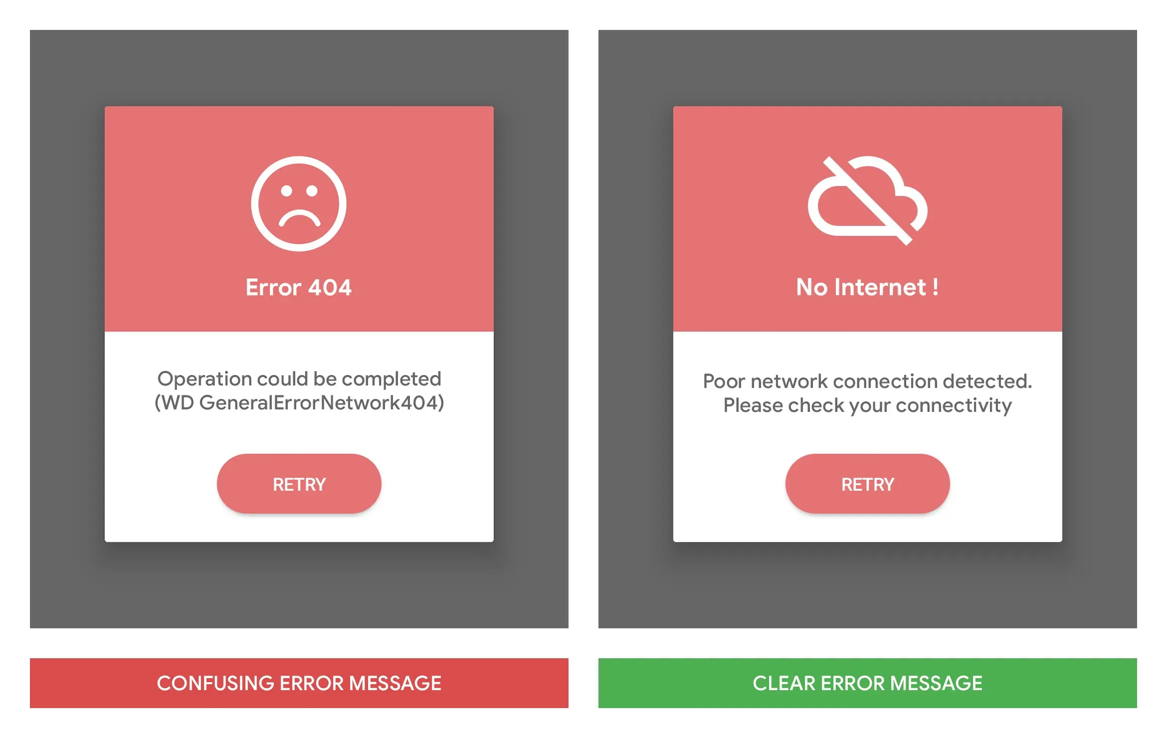
4. Clearly explain any errors that occur
Inevitably, sometimes errors will occur, which are frustrating for your users and may lead to cart abandonment or a discontinuation of use. Here, we’re not necessarily talking about system errors, but user-generated errors, e.g. a photo ID inaccurately uploaded.
It goes without saying that if you’re able to avoid errors, you should try your utmost to do so, and to build other solutions into the workflow instead.
But if the above is impossible, there are several things that you can do to improve the user experience when an error occurs. One of these is to very clearly explain what’s going on and why the error has happened.
Finally, it’s important to help resolve the issue in a timely and efficient manner. To use the example above, if a photo ID is inaccurately uploaded, you can ask the user to try again, ensuring that they have checked that the ID fits inside the frame, and that the right side of the document is on display.

5. Test, test and test again
We all know that testing is a crucial part of any design and development process, so once you’ve released the first iteration of your digital product, it’s highly important that you study user behaviour. Using tools such as Google Analytics, Semrush and Hotjar, you can easily tell how long people stay on given pages, where they lose interest and how high your bounce rate is.
Now is the time to optimise your messaging in order to stop any bottlenecks in your conversion funnel. And remember, the testing process is never truly over! There’s always room for further improvements.
Want to find out more about our Design projects at 10Clouds? Take a look at our page: 10clouds.com/services-design/
Looking for support with your user experience?
Get in touch with us on hello@10clouds.com – we can help you build excellent relationships with your users.